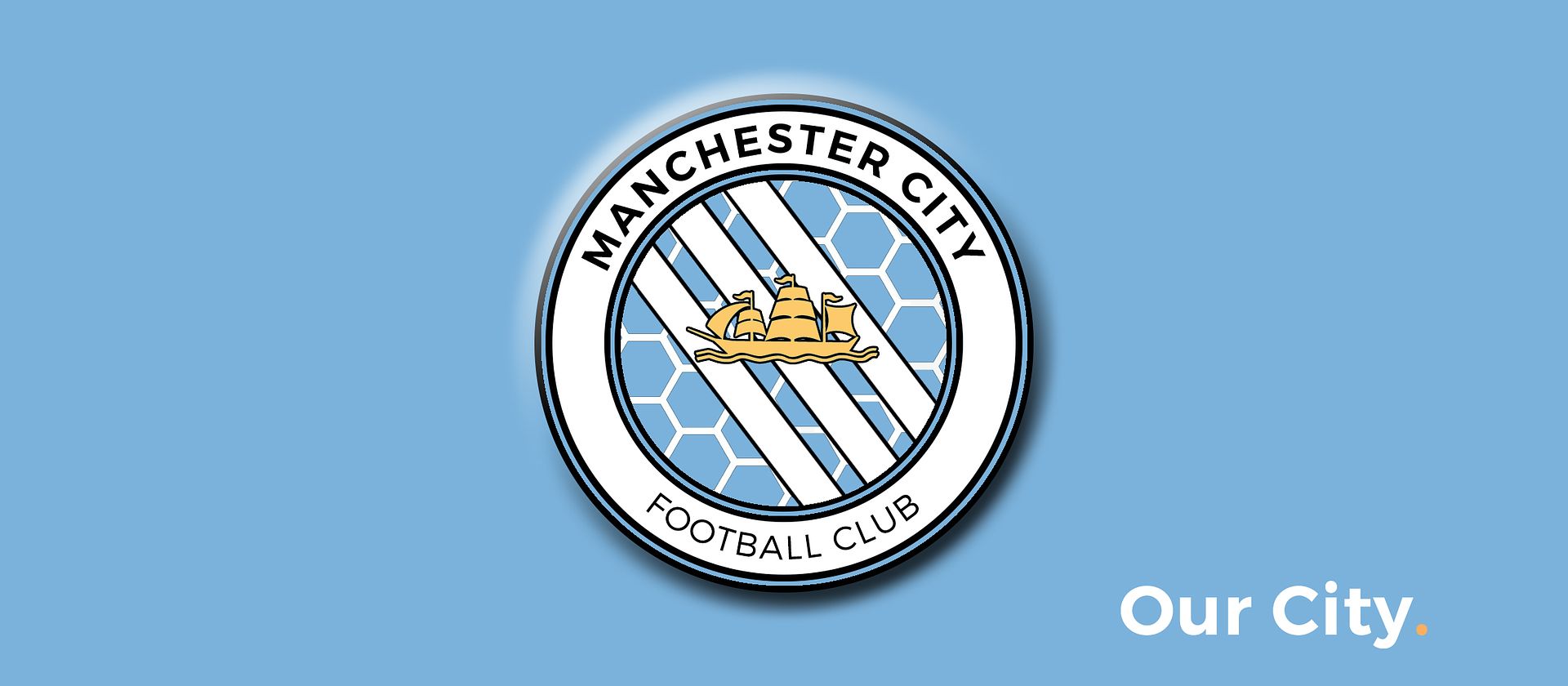
Club Badge (merged)

The maroon is more like the Manchester coat of arms, plus its a modern update of a badge we wore for 70 years

Yeh I like them both mate. For 2 years I've proffered the maroon shield. I think that would look better on a blue shirt, it would stand out more.

However, I think the sky blue shield when not on the shirt, whether it be on TV, a poster, a computer game or whatever, the sky blue and white shield would be instantly recognisable as a City badge. Particularly among younger supporters.

There are advantages to both, but I'd be happy with either.
 
yeah i'm worried about the problem with the look on the kit and other media ... the sky blue tends to make the badge get lost on the shirt ...., thought the white outer band would compnsate, but from a distance it looks just lioke a white circle, nothing else.would prefer the inner shield to be sky blue ... but means the centrepiece background has to be (tin hat on) ...... navy so it stands on on everything kits included.
 
Different%20Badge.jpg


Completely Different, I'm not sure but some may like it
Blue ketchup and now blue honeycombs... deary me.
 
yeah i'm worried about the problem with the look on the kit and other media ... the sky blue tends to make the badge get lost on the shirt ...., thought the white outer band would compnsate, but from a distance it looks just lioke a white circle, nothing else.would prefer the inner shield to be sky blue ... but means the centrepiece background has to be (tin hat on) ...... navy so it stands on on everything kits included.

I did a post a few pages back mate with about 10 different colour schemes (the design was very primary school, but you could get an idea of the colours). I did a few designs with the navy blue centre as you described, but for me the navy just dominated the rest of the badge.

There is never going to be a perfect solution, but if we keep to that main core design I don't think we'll go far wrong.
 
Gary ... will the talks be video'd or in documentation form afterwards, for those of us that are severly disabled and housebound? would be good to know a few about the symbolism of elements and ho they have been adopted by others in history and modern times can change the perspective of them.
Not certain. It would be worth contacting mcfc and asking them. I'm not certain what their plans are. I am happy for them to film me.
 
I did a post a few pages back mate with about 10 different colour schemes (the design was very primary school, but you could get an idea of the colours). I did a few designs with the navy blue centre as you described, but for me the navy just dominated the rest of the badge.

There is never going to be a perfect solution, but if we keep to that main core design I don't think we'll go far wrong.

yeah ... i'm currently working on something thats .... a bit out there .... if i can pull it off that is .... it might work.
 
I guess my point is that it's not fair to lump all us johnny-come-lateys into a know-nothing box. Some of us actually have some sense about us. I have no doubt the club will do the right thing here and even if there are small details that not everyone will agree on, I believe the re-designed badge will satisfy both old and new blues.

Agree and hope you are correct.

After looking through the last 70 pages or so I have come to two conclusions (as one of those johnny-come-latelys):

1) Even though I have been invited by the club to participate in the survey there is no way I will. Just does't feel right or fair to me.

2) No doubt the badge is changing as the club would not invest (and invite) only to stay with the status quo.

PS: So long Eagle Dances with Three Stars. You will always be my first love.
 

Don't have an account? Register now and see fewer ads!

SIGN UP
Back
Top
  AdBlock Detected
Bluemoon relies on advertising to pay our hosting fees. Please support the site by disabling your ad blocking software to help keep the forum sustainable. Thanks.