Club Badge (merged)

Shaelumstash is obviously very opinionated as is his right but let's not witch hunt on designers and design quality. Design is a very personal thing and it's amazing the reactions you will get to any design from even a handful of people. It's super important to not project your own opinions into others

You're absolutely right mate that design is very personal and down to individual taste. If a huge majority of blue like the new design, of course I will accept that, whatever my own views of the design.

The thing I find frustrating is that there is an absolutely colossal majority of City fans wished for something very close to @GeekinGav core design. It's simplicity, it's elegance, and the fact it had a strong nod to our past, while being relevant for the modern world.

The club are fully aware how popular this design is. If they'd bothered to read just a few of the many thousands of posts on these boards over the years they would be fully aware how popular that design is.

Instead, they have gone for something "Original, Modern." I'm very confident that based on the majority view, there was no appetite for something new and original. That was a lot of people's grievance with the eagle, it was seemingly plucked out of nowhere and had little or no connection to the club or city.

It's a nice concept the club asking us what symbols mean something, but as I've said many times, personally if the final design doesn't work, the symbols are completely irrelevant. As an example, I prefer the 3 rivers to the rose. But I would prefer an updated version of the 1972 crest with the rose than an imitation of the Melbourne badge with the rivers, rose, date and ship all bundled in together.

I feel like the club have asked questions, but they've not actually listened.

Same with the blue shorts, the club are fully aware how unpopular these are, but they choose not to listen.

They take the opinion that it is their club and they can do whatever they wish with our identity and toss our history to one side at their whim.

The questionnaire was really a trojan horse for the club to give us a completely new and original design, and hide behind the idea that we the fans picked it. That's wrong, there was no desire for a completely new and original design, and the club know that.

The reason I get opinionated and passionate about these things is because they mean a lot to me. I'm a 4th generation City fan, this club is in my blood and plays a big part of my life, and the club's identity is really important to me. What I don't like is when executives with no appreciation of the history and identity of the club, come in and do as they please and change things around when there is no appetite for it from the people that matter - the long standing fans.

They might surprise me, the badge might turn out to be great and really popular. But I already know from the fact the rose and the 1894 are included somewhere, that it's not going to be the design that most fans wanted. They are trying to squeeze too much in, when the appetite from the fans was the opposite. We wanted a clean, simple badge like Gav's, and no matter how good the design is, we are not going to have that now because there are too many elements included.
 
Is that what his strop was about ? I couldn't understand a word of it, I thought he'd been tasting the "mince pies" before he wandered in.

he made several points about the "wine" .... i wonder if he added a bit of dutch courage in it ....
 
You're absolutely right mate that design is very personal and down to individual taste. If a huge majority of blue like the new design, of course I will accept that, whatever my own views of the design.

The thing I find frustrating is that there is an absolutely colossal majority of City fans wished for something very close to @GeekinGav core design. It's simplicity, it's elegance, and the fact it had a strong nod to our past, while being relevant for the modern world.

The club are fully aware how popular this design is. If they'd bothered to read just a few of the many thousands of posts on these boards over the years they would be fully aware how popular that design is.

Instead, they have gone for something "Original, Modern." I'm very confident that based on the majority view, there was no appetite for something new and original. That was a lot of people's grievance with the eagle, it was seemingly plucked out of nowhere and had little or no connection to the club or city.

It's a nice concept the club asking us what symbols mean something, but as I've said many times, personally if the final design doesn't work, the symbols are completely irrelevant. As an example, I prefer the 3 rivers to the rose. But I would prefer an updated version of the 1972 crest with the rose than an imitation of the Melbourne badge with the rivers, rose, date and ship all bundled in together.

I feel like the club have asked questions, but they've not actually listened.

Same with the blue shorts, the club are fully aware how unpopular these are, but they choose not to listen.

They take the opinion that it is their club and they can do whatever they wish with our identity and toss our history to one side at their whim.

The questionnaire was really a trojan horse for the club to give us a completely new and original design, and hide behind the idea that we the fans picked it. That's wrong, there was no desire for a completely new and original design, and the club know that.

The reason I get opinionated and passionate about these things is because they mean a lot to me. I'm a 4th generation City fan, this club is in my blood and plays a big part of my life, and the club's identity is really important to me. What I don't like is when executives with no appreciation of the history and identity of the club, come in and do as they please and change things around when there is no appetite for it from the people that matter - the long standing fans.

They might surprise me, the badge might turn out to be great and really popular. But I already know from the fact the rose and the 1894 are included somewhere, that it's not going to be the design that most fans wanted. They are trying to squeeze too much in, when the appetite from the fans was the opposite. We wanted a clean, simple badge like Gav's, and no matter how good the design is, we are not going to have that now because there are too many elements included.
I like the rose and the 1894. How do you know most don't?
 
I like the rose and the 1894. How do you know most don't?

Lot's of people like the rose, and I'm sure lots of people like the 1894 too. I've never said most people don't like either of those elements.

But I'm not talking about elements, I'm talking about final designs.

The final design that is most popular on here is Gav's one with the ship, shield and 3 rivers. I know this because I've followed the thread very closely over the last few years. Don't believe me? Feel free to trawl through the threads.

Gav also did a design which was an updated of the 1972 badge with the ship, shield, and rose, that was also really popular.

But a design with the ship, 3 rivers, rose, and 1894? There hasn't been any popular designs with all of these elements included, and the feedback has been that they look too cluttered.

Hope that answers your question.
 
No matter what it looks like I guarentee
- Some will love it
- Some will like it
- Some will be apathetic as to liking it or not (not give a fuck)
- Some will be "meh"
- Some will wish it didn't have this or that in it
- Some will wish it had this or that in it
- Some will not like it much
- Some will dislike it
- Some will hate it
- Some will loathe it
- Some knobs will be still asking why they can't have the old one back
and that's what happens after a consultation - you can kind of see why the clubs selection is a difficult one.
My opinion - "its a fucking badge" or "logo" or "Trade Mark" or "Club Brand" and as long as it pays appropriate homage to our history and the elements of it are attributable to the club and or city of Manchester I'll be reasonably happy. Lets be fair we don't fuck many things up any more despite what the whingers on here say or think. :)
And some will blame it on Pellegrini's tactics...
 
Lot's of people like the rose, and I'm sure lots of people like the 1894 too. I've never said most people don't like either of those elements.

But I'm not talking about elements, I'm talking about final designs.

The final design that is most popular on here is Gav's one with the ship, shield and 3 rivers. I know this because I've followed the thread very closely over the last few years. Don't believe me? Feel free to trawl through the threads.

Gav also did a design which was an updated of the 1972 badge with the ship, shield, and rose, that was also really popular.

But a design with the ship, 3 rivers, rose, and 1894? There hasn't been any popular designs with all of these elements included, and the feedback has been that they look too cluttered.

Hope that answers your question.
I can see what you're saying and have no problem with that.

I'll personally reserve judgement until Boxing Day and then either be happy or kick off.
 
I like the rose and the 1894. How do you know most don't?

Well I know I don't like the rose, it's not relevant. As for 1894 that depends how its displayed, if it's split then it's a no from me.

I get the feeling that most like ship above 3 rivers. Not scientific in any way, just seems that way
 
I can see what you're saying and have no problem with that.

I'll personally reserve judgement until Boxing Day and then either be happy or kick off.

Yep that's probably the best approach.

I was initially buzzing when the ship and rivers teasers were released.

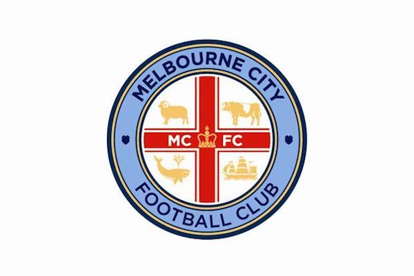
Then as the 1894 and the rose one got released, my heart sank as I imagined our very own version of the Melbourne badge with a load of elements squeezed in. It's the same design team afterall.

Let's hope the reveal on Boxing Day goes well and everyone is happy.

If they're not I hope City fans have the balls to come out and do something about it, like Everton did.

Melbourne-City-FC-logo-badge-crest-600w.jpg
Wow. That's pretty busy. Though I like the sheep.
 

Don't have an account? Register now and see fewer ads!

SIGN UP
Back
Top
  AdBlock Detected
Bluemoon relies on advertising to pay our hosting fees. Please support the site by disabling your ad blocking software to help keep the forum sustainable. Thanks.