SJC
Well-Known Member
Exactly. That would be brilliant.i miss football club already

Exactly. That would be brilliant.i miss football club already

Makes it look less like a brewery logo to be fairExactly. That would be brilliant.
You've gotta be happy it doesn't look like the Melbourne City badge though?mine were nothing special, just what we have before in the look of the supposed CFG brand. now thats been fucked off with.
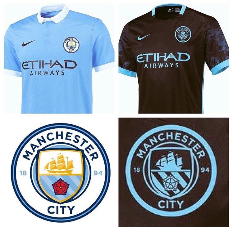
i see what they tried to, Vectors and stuff, but its all .... jumbled in styles .... thats what i mean by amateurish ... its line drawing/vector/clipart ... it looks tacky. its like a collage that different people have stuck together.
they had the opportunity to really excel at this, and i mean really excel beyond the ones i bothered to do with too .... but they havent.
really disappointing.
Well what a big surprise that you don't like it.

mine were nothing special, just what we have before in the look of the supposed CFG brand. now thats been fucked off with.
i see what they tried to, Vectors and stuff, but its all .... jumbled in styles .... thats what i mean by amateurish ... its line drawing/vector/clipart ... it looks tacky. its like a collage that different people have stuck together.
they had the opportunity to really excel at this, and i mean really excel beyond the ones i bothered to do with too .... but they havent.
really disappointing.
From reading your posts, there are few things you do seem to like, its only an opinion.I know, I've got impeccable taste, but don't hold that against me.
