Higor Douglas
Well-Known Member
- Joined
- 13 Jul 2015
- Messages
- 576
- Team supported
- Atlético Mineiro
You liked him alongside the other?

Before:
Before:
Not for me.
back to the football.
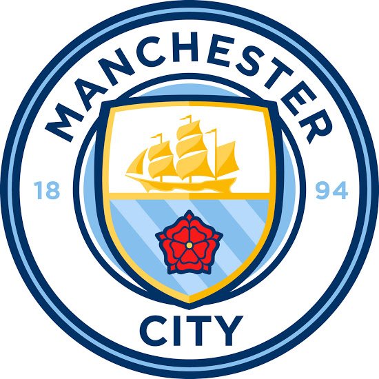
In your unlicensed professional opinion which is better.Yeah, honestly it is. Not being snobby or petty, the shield and ship is well done.
The font is wrong to me, too thin and looks more like Monserrat (free font) not Gotham used on the other City group badges.
And why have City horizontal a circle when you can easily arc it? Looks like the guy that did it doesn't know how to do an inverted arc path.
More I see and think, I think it's amateurish... And that's coming from an amateur designer.

Thought they just use the old badge with their text?
Some of your efforts id have also loved Gav.
But this I also love, it's our badge back with a few tweaks.
LOL, what the f*ck difference does the font make ? What font is the ship ?he fonts are horrendous.
I loved your designs Gav but I love this one too.
I'm just glad to see the rose back.