mancityvstoke
Well-Known Member
- Joined
- 15 Apr 2009
- Messages
- 23,385
- Location
- Vintage terraced Kippax
- Team supported
- The only football team to come from Manchester
We are NOT having Foghorn Leghorn on any new badge...........
It could be a masonic symbol anyway.....no one really knows and certainly predates anything truly Manchester City Football Club.
By the way who mentioned Nazi's?
All Germans are Nazis now?You said German tank and plane
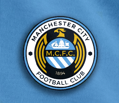
This one..the overall design has promise...with a little tweaking it could be good

now I know you're taking the piss.....****In fact maybe extend the wings to nearly encircle the centre..that would be pretty cool
We are NOT having Foghorn Leghorn on any new badge...........
The MCFC would have to go yes...not sure about the 1894 too...maybe in another font...don't mind a little gold for the bird...makes it pop a little
Everyone's got different taste, but seriously I think this is the worst design on the entire thread.
The ship and stripes in a circle doesn't really make any sense either. They appear in a shield on the CoA and all of our badges in history, putting them in a circle for no apparent reason just doesn't make any sense from a symbolic or design point of view. The only reason they seem to be in a circle is so you can see the 'wings' of the squashed bird.
"
circle symbol? You mean City Circle? The one everyone is moaning about?
Do you get to many games?
You'll see depth if the bird is blue, it's 'stylised, no reason for it to be gold coloured, it dont add, blue does...very outer edgeing needs to be navy
I like the adidas ship sat in a bluemoon circle, we've got a circle symbol implanted in the floor somewhere outide our ground have we not?...got bluemoon written on it i believe, good enough for the floor good enough for the centre of our badge.
No idea....you tell me....oh and provide a linkYeah....i meant ciy circle, i did'nt mean City Shield obviously...everyone moaning....i'm not giving everyone's opnion, been to a few games and a few trials.
How about you....you discovered why that college on mill street have set aside ptch on the campus yet?
So let me get this right, you want City's badge to have blue eagle, with a blue circle inside because we've got a circle on the floor outside the ground? You don't work in the creative industries do you...?
This one..the overall design has promise...with a little tweaking it could be good

The cartoon squashed eagle that looks like it's being viewed through a fish bowl isn't even instantly recognisable as the eagle we've got now, so it kind of defeats the object.

No idea....you tell me....oh and provide a link
QUO
Yu dont want a thick sliced loaf while i'm going to the shop do ya?
The is no reason for the budgie to be gold coloured, a skyblue version would add more blue, plenty bue like....you now the colour we play in, instantl recognisable and all that jazzamatazz whilst helping to frame the sky blue moon centre chapter to the white outer chapter via the navy in-fill..
A bird that's squashed you say!

