kaz7
Well-Known Member
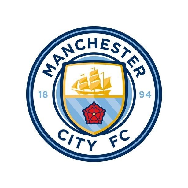
I think with the football club it's too busy,i do wish the city was curved but just nitpicking
Has anyone mocked one up with just F.C. rather than Football Club? I think the Manchester City looks too squashed at the top.
This would be better - and make the shield triple topped.. but thay're not going to change that now :(
Best we can hope for is a change of the writing to include FC.
Apologies for my poor photoshop skills btw! (only did it quickly)
I personally have never heard of Stoke and doubt they are a football team.
How can there be a removal of words that were never on there?When people says things like we are a 'brand' it is a glib, soundbite that they have probably heard elsewhere so feel they can quote the meaningless words also without any real knowledge or understanding of exactly what a 'brand' is.
If City is now a 'brand' then please explain the following:
What is the core product or service of the 'brand'?
What does the 'brand' actually represent or articulate?
How is the removal of the words 'Football Club' relevant to the brand hierarchy?