FogBlueInSanFran said:
JoeMercer'sWay said:
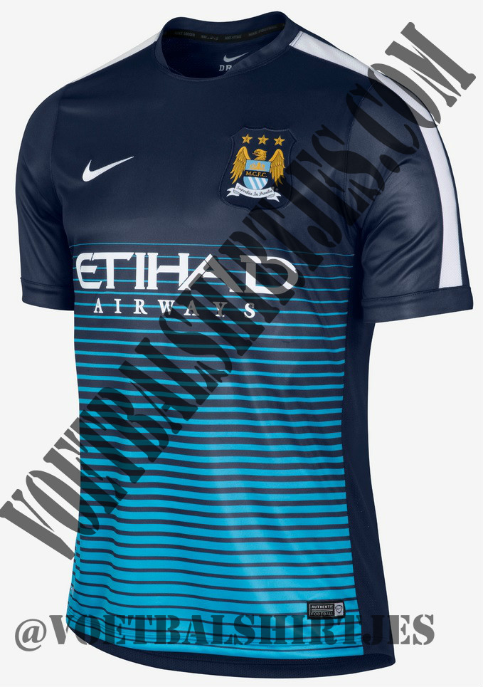
yeah, it does look like a training top, in which case it's still poor but bleh, the shoulder stripes are very "training top", but that is a similar colour scheme and style to the other leaked away, except that looks "slightly" better, though it still looks like it's runny ink.
I would think the shoulder stripes are a giveaway that it must be a training top -- there's no space left for the (gold) league badges and I'm hard pressed to think of a kit that doesn't leave that space (Adidas, who's all about the three stripes, usually if not always does, I think).
it
is a training top, but Nike have done that stripe over the shoulder before on kits (Scum and Villa a few years ago), but its close to what the the away shirt will be like, more of a gradient fade effect, if the ITK's on here are right.
well....
the store on the OS ..... the Cup Away (3rd) kit has disappeared from the menu and you can only buy the long sleeved away. But you can still buy all the home versions for the normal price ....hmmmmm ....... thinking its cos of the Champs14 promo ......... but still ........ hmmmmm!