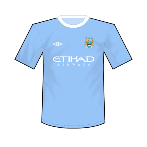
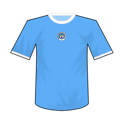
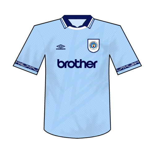
Sky blue/white/sky blue. Or,
Sky blue/white/navy
Nike need to keep some consistency with the look of the City home kit. This is the look of Man City. Of our brand. The way United, Chelsea, Liverpool and Arsenal for the most part don't change their color patterns much each year. Rightly so. With CIty, both Nike and Umbro for that matter, always felt the need to get creative with the home kit. Just keep it simple!
They can feck with the away and 3rd all they like but no need to modernize this classic look.
Totally agree.
You know what the Rags kit will be next season, you know what Chelsea, Liverpool and Arsenal's will be... yet ours is anyones guess most seasons!!! Nike and the Club need to stop fucking about with the Home kit – keep it the same... i'm not really arsed about the away kit!

