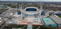
The roof was left like that for the first game v Liverpool and then they used pallets to fill the gap and it was a botched job all construction season with a waterfall feature at times.
Glad I am not in the north stand when all that goes on.
The roof was left like that for the first game v Liverpool and then they used pallets to fill the gap and it was a botched job all construction season with a waterfall feature at times.
Glad I am not in the north stand when all that goes on.
They could and should have linked them into East level 3.
I’m trying to but I’m struggling to like the design of it.I agree here.
The COOP arena, although basic in shape does like interesting, sleek, modern.
I'm really struggling with the visual for the hotel/extensions.
I've rested on them for a few days then search out opinions and seems the general consensus (outside of this forum) is they''re pretty uninspiring at best.
The symmetry (which made the stadium really special) has gone and those 60's school/office building similarities are hardly off the mark.
Drab design (I can't see any evidence of architecture).
Is it too late down the road for these to be sent packing?
Manchester as a city has escaped much of the poor new builds going up in other cities, but seems not in this location and to some extent Salford Quays/Mediacity).
I think I'm just disappointed as this thread once promised a lot of special things (and those super casino proposal visual still look exciting)
This looks utterly abhorrent, like a MS Paint job. Hope I'm proved wrong and it's all part of a masterplan I'm not seeing yet.