Bluemoon115
Well-Known Member
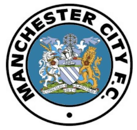
I was bored, so made a quick "mix" of old and new.


Bluemoon115 said:I was bored, so made a quick "mix" of old and new.


See, I've been thinking along those lines myself. We're City: badges, we don't need no stinking badges!urmston said:How about no badge at all?
We didn't have a badge on the shirt until about 1972ish.
Do we need a badge?

Brucie Bonus said:See, I've been thinking along those lines myself. We're City: badges, we don't need no stinking badges!urmston said:How about no badge at all?
We didn't have a badge on the shirt until about 1972ish.
Do we need a badge?

On the other hand, you can't market / brand a nothing, er, you know, that kind of oo-jah spliff money-making thinking?
The major reason I like the "old" badge isn't because it's "old" or anything of the sort, it's because it's "in-your-face". Some of the blokes who like the new one claim it's "dynamic". I have no fecking idea what that means, but it sounds awfully "luvvie" or PI Pseuds-like to me...also sounds a little Hughes-ish. Some have said the new one is (more) aggressive. I think I know what they mean, but to my mind there's nothing as "aggressive" as being confronted with "Manchester City F.C." in plain, bold, unmistakeable terms. There's no mistaking for a second who we are...with the old one. The perfect circle is the way...get it in Cooky!

