J.Marr is Genius
Well-Known Member
M9 Blue said:And replace them with 1894Immaculate Pasta said:
This one, a quality badge but remove the three stars.
Why not 1880 ?
M9 Blue said:And replace them with 1894Immaculate Pasta said:
This one, a quality badge but remove the three stars.
J.Marr is Genius said:M9 Blue said:And replace them with 1894Immaculate Pasta said:
This one, a quality badge but remove the three stars.
Why not 1880 ?

BudtheWeiser said:Something like this for me.

They had to ask permission to use it,we don't.Bluemoon115 said:johnny crossan said:I make no apology for returning to this point. Bluevengeance has raised a serious problem here. The current badge should be changed immediately given its obvious similarity to the 1958 Man U one. The person who approved this design surely didn't realise this connection.

THe eagle is part of an old Manchester coat of arms type thing (there used to be an image).
It's part of Manchester that both clubs have used. Absolutely nothing wrong with that (Apart from them not being from Manchester, but thats a different issue).

bluemanc said:BudtheWeiser said:Something like this for me.
This would look better in the middle.

Bluemoon115 said:I was bored, so made a quick "mix" of old and new.


See, I've been thinking along those lines myself. We're City: badges, we don't need no stinking badges!urmston said:How about no badge at all?
We didn't have a badge on the shirt until about 1972ish.
Do we need a badge?
Brucie Bonus said:See, I've been thinking along those lines myself. We're City: badges, we don't need no stinking badges!urmston said:How about no badge at all?
We didn't have a badge on the shirt until about 1972ish.
Do we need a badge?
On the other hand, you can't market / brand a nothing, er, you know, that kind of oo-jah spliff money-making thinking?
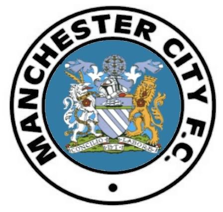
The major reason I like the "old" badge isn't because it's "old" or anything of the sort, it's because it's "in-your-face". Some of the blokes who like the new one claim it's "dynamic". I have no fecking idea what that means, but it sounds awfully "luvvie" or PI Pseuds-like to me...also sounds a little Hughes-ish. Some have said the new one is (more) aggressive. I think I know what they mean, but to my mind there's nothing as "aggressive" as being confronted with "Manchester City F.C." in plain, bold, unmistakeable terms. There's no mistaking for a second who we are...with the old one. The perfect circle is the way...get it in Cooky!