FogBlueInSanFran
Well-Known Member
I've finally had a chance to look at the new kit designs -- usually I am obsessed with this. With historicalfootballkits.co.uk effectively out of commission (with a City-hater at the helm of it anyhow), I've had to use other than normal sources.
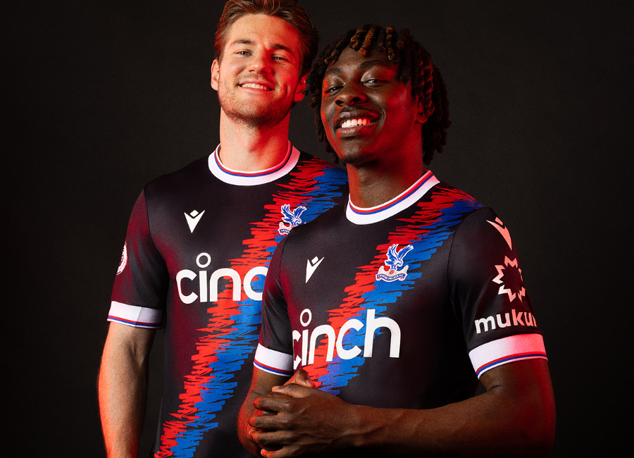
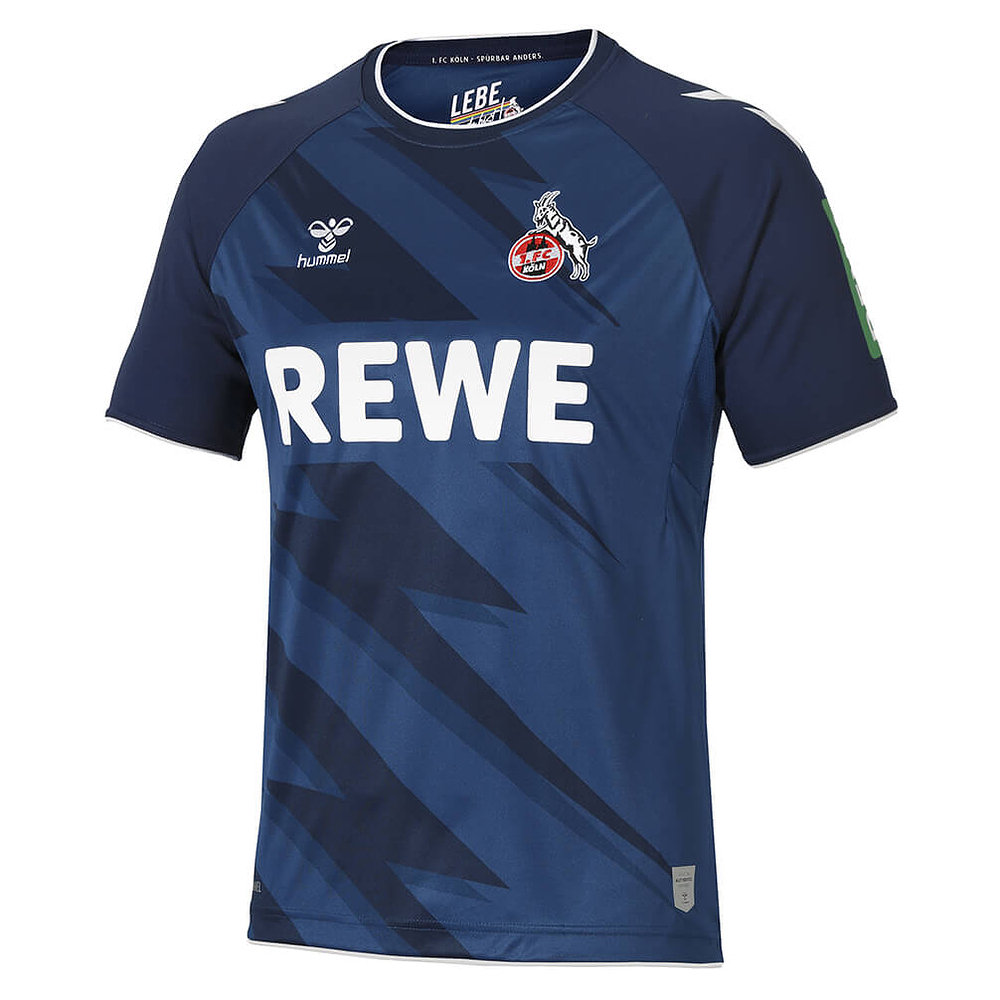
This is -- by three standard deviations -- the ugliest, most abominable collection of football kits in England since the mid- 1990s. I will brook no dissent on this opinion. It's a fact. It as almost as if designers are trying not to sell kits.
It's not just awful, cluttered, ham-fisted, jumbled, mismatched, askew, dis-organized designs and bizarre color pairings that are the issue. It's also that the best and simplest kits have been ruined by huge sponsorship logos -- clearly oversized relative to the past -- many of them for gambling houses and/or in Chinese characters. Nothing against China, but Chinese characters clutter up kits, even in China.
Picking a worst-of will take longer than creating a submission to one of @BlueHammer85's top 20 songs/album threads, and be far, far less enjoyable.
I'm sure I've never written a post this long on this topic before, and normally I'm pretty charitable when it comes to kits, but this is fucking awful and I dearly hope it presages a return to simple, classic designs next year.
I dislike City's kits this year (though I understand the motifs) but having seen those of other clubs I'm thankful ours aren't worse.