Yeah it was this. Our shirt was a pretty pale and shiny light blue, and the sun was low in the sky and it was hard to see the difference.I think they were wearing White shirt. Sky blue away shorts and white socks. And we were wearing the opposite.
You are using an out of date browser. It may not display this or other websites correctly.
You should upgrade or use an alternative browser.
You should upgrade or use an alternative browser.
City’s New Kits
- Thread starter PannickAtTheDisco
- Start date
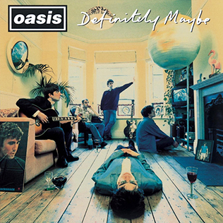
Am I an idiot but what the hell has it got to do with Definitely Maybe in terms of colours?
The album spine is that shade of blue. If you imagine both spines being the blue parts of the kit, the rest is vaguely the colour of the front of the album. The effect round the badge is a bit like the spinning light shade.
Kind of anyway.
HelloCity
Well-Known Member
The album spine is that shade of blue. If you imagine both spines being the blue parts of the kit, the rest is vaguely the colour of the front of the album. The effect round the badge is a bit like the spinning light shade.
Kind of anyway.
Noel says it’s a sound wave.
Cheadle_hulmeBlue
Well-Known Member
- Joined
- 27 Oct 2012
- Messages
- 19,274
The bucket hat is decent …
Bought that for my daughterThe bucket hat is decent …
Blue on Sea
Well-Known Member
- Joined
- 26 Jul 2017
- Messages
- 57
I hate it when they change the colour of the badge to match the kit. The rose should always be red.
Oyster28catcher
Well-Known Member
- Joined
- 3 Jul 2010
- Messages
- 7,610
- Location
- https://acton28.blog/
- Team supported
- CITY/Aberystwyth Town
Ideal for present day weather in MancLooks like when you go in holiday, slather yourself with suncream, and it mixes with your sweat and sand and stains your white shirt.
Supersonic sound waveNoel says it’s a sound wave.
Oyster28catcher
Well-Known Member
- Joined
- 3 Jul 2010
- Messages
- 7,610
- Location
- https://acton28.blog/
- Team supported
- CITY/Aberystwyth Town
This. This. Always that. Always. Pi$$Ed off enough with the prices. Then find out we're wearing a kit with no onus on home.Whatever anyone thinks of this kit, it should be banned for clubs to wear away shirts at home.
The women wore the dragon kit for CNY versus Utd in a Derby last season. That was a travesty!
Wearing Dynamic Pricing designer's kit is an abomination.
Luddite_Blue
Well-Known Member
- Joined
- 3 Jun 2009
- Messages
- 743
I think it happened twice. Mid to late 80s with no TV cameras there and this one. Don’t know why sky blue and yellow clashed. And we appear to have started in maroon.
The game I was thinking of we definitely went off the pitch to change. Maybe Gary James could enlighten us?
The cover of this programme shows the other Spurs game

HelloCity
Well-Known Member
Am I an idiot but what the hell has it got to do with Definitely Maybe in terms of colours?
Brilliant. I thought I was losing my mind. Great photo that too.
That game was the Mick McCarthy Thunderbastard Header in front of the North Stand.
Luddite_Blue
Well-Known Member
- Joined
- 3 Jun 2009
- Messages
- 743
Brilliant. I thought I was losing my mind. Great photo that too.
That game was the Mick McCarthy Thunderbastard Header in front of the North Stand.
Longballutd
Well-Known Member
- Joined
- 5 Aug 2015
- Messages
- 966
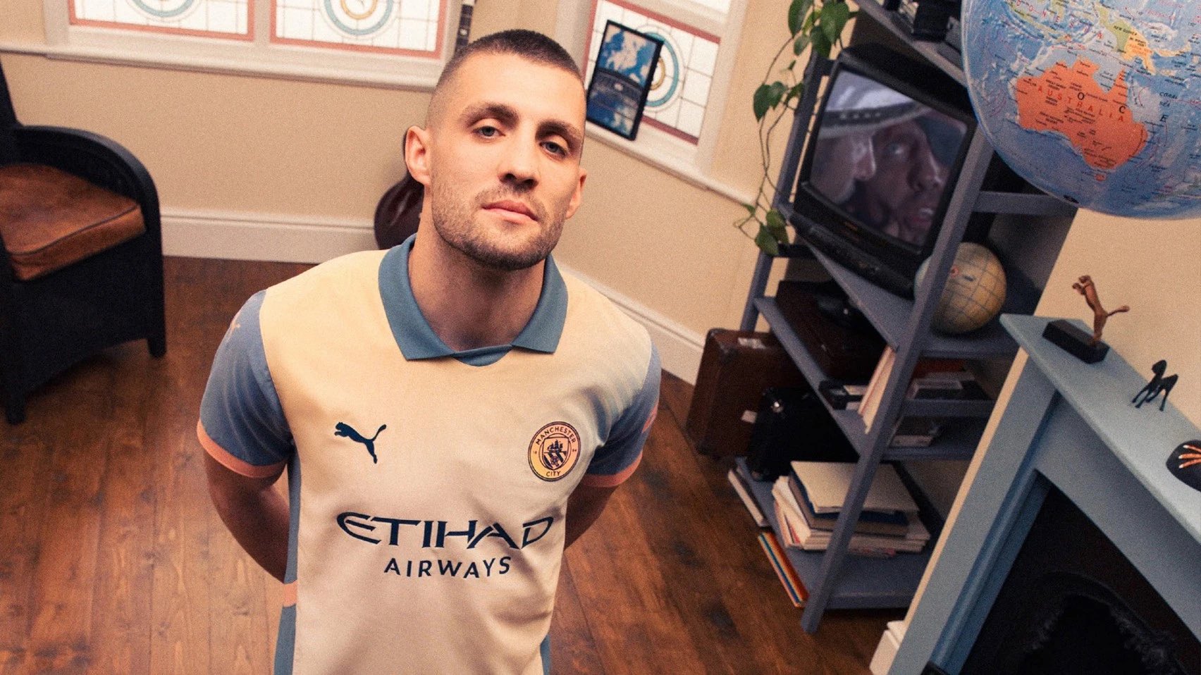
I really like the Supersonic 4th kit but just can’t understand why it hasn’t got the proper City crest. Hate all the daft looking crests they come up with.
mscenterh750
Well-Known Member
I need that top desperately to finish off my favourite city shirt collection.
Cobwebcat
Well-Known Member
I like it on Kovacic. Growing on me.
jimharri
Moderator
There's a bloke on Facebook who does decent retro replicas. Pretty sure he does that Phillips R&B shirt.I need that top desperately to finish off my favourite city shirt collection.
Agueroooooooooooo
Well-Known Member
- Joined
- 8 Dec 2016
- Messages
- 323
What do I have to consume before I can see this?!The album spine is that shade of blue. If you imagine both spines being the blue parts of the kit, the rest is vaguely the colour of the front of the album. The effect round the badge is a bit like the spinning light shade.
Kind of anyway.
mscenterh750
Well-Known Member
Cheers mate I’ll get registered and have a look for him.There's a bloke on Facebook who does decent retro replicas. Pretty sure he does that Phillips R&B shirt.