Club Badge (merged)

its ok to do a new badge for a club like NYCFC because its brand new, maybe the Aussies are more chilled about rebranding their clubs ... but with a club like City with many generations and era's supporting, each view is different and merited, thats why i think at the end, a lot will be disappointed cos its virtually an impossible job, given all the elements, to to have a perfect badge for everyone.

hope they can ... but aint gonna bet on it
 
Really doesn't matter if they keep the eagle cause fans from the last 17 years are used to it or new fans only know it or return to city's REAL badge of a circle. I know I will buy/wear the old range if the eagle stays unless I get a kit (which ali express will supply) never liked franny lee's fucked up badge and also his stint in charge

Though btw this is being typed while in gulivers on oldham rd after 12 pints
 
its ok to do a new badge for a club like NYCFC because its brand new, maybe the Aussies are more chilled about rebranding their clubs ... but with a club like City with many generations and era's supporting, each view is different and merited, thats why i think at the end, a lot will be disappointed cos its virtually an impossible job, given all the elements, to to have a perfect badge for everyone.

hope they can ... but aint gonna bet on it
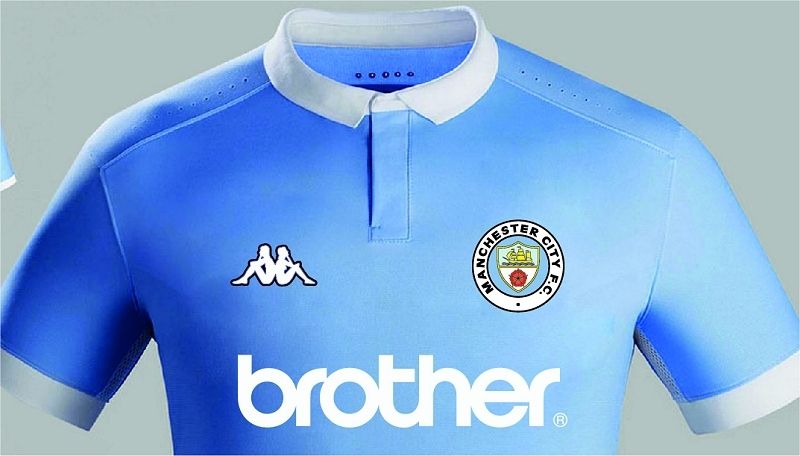

Agreed. For what it's worth, and despite my championing of the eagle theme, this is the way I think the discussion went at Etihad Towers and why we will inevitably have a version of the old round badge:

"Look chaps, we need to change the City badge to bring it in line with the Melbourne and NYFC badges to have a consistent corporate identity throughout the whole group but if we just change it we are certain to p**s off at least half of the fans, so how do we go about it"?

Up pops Tarquin from the social media department: "I know!, I've been tracking this bluemoon thingy ontinterweb and there are a few on there who keep banging on about the old round badge and they seem to be, in the main, loyal Cityzens. Why don't we stoke it up and let them do the work for us? It's bound to work, we can even have a vote and let them think it was their idea all along". Good PR that is.

Job done!

Or am I being too cynical?
 
Really doesn't matter if they keep the eagle cause fans from the last 17 years are used to it or new fans only know it or return to city's REAL badge of a circle. I know I will buy/wear the old range if the eagle stays unless I get a kit (which ali express will supply) never liked franny lee's fucked up badge and also his stint in charge

Though btw this is being typed while in gulivers on oldham rd after 12 pints
Wtf? Gullivers?!!? Get across the road to the Castle - better beer and music ;-)
 
Agreed. For what it's worth, and despite my championing of the eagle theme, this is the way I think the discussion went at Etihad Towers and why we will inevitably have a version of the old round badge:

"Look chaps, we need to change the City badge to bring it in line with the Melbourne and NYFC badges to have a consistent corporate identity throughout the whole group but if we just change it we are certain to p**s off at least half of the fans, so how do we go about it"?

Up pops Tarquin from the social media department: "I know!, I've been tracking this bluemoon thingy ontinterweb and there are a few on there who keep banging on about the old round badge and they seem to be, in the main, loyal Cityzens. Why don't we stoke it up and let them do the work for us? It's bound to work, we can even have a vote and let them think it was their idea all along". Good PR that is.

Job done!

Or am I being too cynical?

It's possible. But it's probably more likely they've looked at the thread and said "Bloody hell it seems pretty much every fan wants to return to the roundel badge except for desperatedon and all his progressive, match going mates". ;-) Only kidding mate.

But if you're being cynical I'd say it's more likely they've designed the NYCFC and Melbourne badges to be circular because it was part of their long term strategy to redesign our badge to be circular. Otherwise, why wouldn't they have made their badges have eagles and stars? The whole point of those club's existence is to extend our brand, so it makes no sense for the badges to be completely different.

Maybe your version is right Shaelumstash, you make a very good and interesting point, I suspect however that we will never know.

I feel that the outcome (round badge) will still be the same either way, but my vote would be for a round badge with the (now world famous) eagle in the middle and Manchester City Football Club 1894 in the border.
 
THIS JUST FITS FOR ME. THE BADGE IS SIMPLE AND BEAUTIFUL, THE ROSE IS PART OF OUR HISORY, MAYBE CHANGE THAT FOR ST GEORGE'S CROSS BUT IF WE WENT BACK YO THIS I WOULD BE HAPPY.


Imaglle1_zpsqtkcqfxy.jpg
 
Are you a cityzen member?

If you are you should have had an email

The questionnaire is only available to members
Yeah I think so, never actually looked inti the cityzen stuff but I've got a season which automatically makes me a member I thought. I'll check my emails in the morning, cheers for letting me know
 
it has got to be the Manchester coat of arms, we were formed in Manchester and play in Manchester, it would also piss the rags off no end
 
Keep the current badge, just remove the feathery thingy, and surround it with a gold colorured double circle with the name of the club inside it. The black stripe initials below the ship should be changed to 1894 or 93:20. No crosses, roses, bosses, bees.

Or stick to Geeking Gav's.
 
Keep the current badge, just remove the feathery thingy, and surround it with a gold colorured double circle with the name of the club inside it. The black stripe initials below the ship should be changed to 1894 or 93:20. No crosses, roses, bosses, bees.

Or stick to Geeking Gav's.

i have put some versions with crosses, roses and bees ..... sorry. but ended just having the old circle/moon eventually.

I don't get the 'period of success' argument.

Strange that they sell San Francisco coffee in Mexico. You learn something new everyday...

yep, seeing isnt always truly understanding lol
 
CrYpSjw.jpg


I'd like to have the crosses included but we're not going have 'religious' symbols on the badge.

Some say the rose has nowt to do with Manchester but it is part of our history. Rather have roses than fucking bees! lol

I like this one, although I'd prefer bees to the roses. The bee is the symbol of Manchester and it's working class, Industrial Revolution roots, which is exactly what Manchester City have epitomized been since their formation. I'm not opposed to the rose, just declaring what my preference would be(e)!

The other thing I would mention is that while this badge has the sky blue center, I'm not sure how that would look with various different second/third kits. Accordingly, I'm just wondering whether a "clear" space between the shield and the outer ring would allow for the second/third kit colour to come through? Trying to remember what the red and black shirt looked like with the old round badge?

In short, it HAS TO BE a round badge, no eagles, no stars, no nonsense MANCHESTER CITY badge...and WILL BE in keeping with the clear motif of the other CFG badges, just as the powers that be want it to be!
 
Last edited:
I like this one, although I'd prefer bees to the roses. The bee is the symbol of Manchester and its working class, Industrial Revolution roots, which is exactly what Manchester City have epitomized been since their formation. I'm not opposed to the rose, just declaring what my preference would be(e)!

The other thing I would mention is that while this badge has the sky blue center, I'm not sure how that would look with various different second/third kits. Accordingly, I'm just wondering whether a "clear" space between the shield and the outer ring would allow for the second/third kit colour to come through? Trying to remember what the red and black shirt looked like with the old round badge?

In short, it HAS TO BE a round badge, no eagles, no stars, no nonsense MANCHESTER CITY badge...and WILL BE in keeping with the clear motif of the other CFG badges, just as the powers that be want it to be!

not gonna get anything but 2 tone badges on the Nike away and 3rd kits, no matter what the badge looks like so the colours arent relevant from that perspective.

ywnk2i.jpg

*showing my designon this years hone, away and 3rd kits themes ... before anyone says "***ing hate that colour scheme!!" lol


the only concern is the home kit .... hate the eagle, but it makes the badge stand out. some dont work on kits.

462twy.jpg
 
Last edited:

Don't have an account? Register now and see fewer ads!

SIGN UP
Back
Top