IanBishopsHaircut
Well-Known Member
So the consultation is over
Now for the fun part ;-)
Now for the fun part ;-)
This. .How long does this process take?
Ever played Ip, Dip, Dash?How long does this process take?
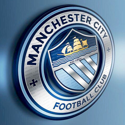
If we are to have a completely new badge then this is so far the bestThis is perfect and as people have pointed out, the colours can be changed depending on what colour kit we're wearing at any point. Start with this and change the colours to more sky blue and white if we have darker away kits such as navy, maroon or red & black.
If we are to have a completely new badge then this is so far the best
This without the crosses is my ideal choice, beautiful badge!
This without the crosses is my ideal choice, beautiful badge!
Fingers crossed mate. This core design without the crosses works in pretty much every feasible colour scheme as well. Perfect for the modern world.
When this process started I was really happy because I thought essentially we're either going to get our roundel back, with the rose or rivers, or stick with what we've got.
My personal preference is the roundel with rivers, but if we ended up with the rose, or even stuck to the current badge, I could live with that, it would still feel like a City badge.
As the procees has gone on though, I've become increasingly concerned we're going to end up with some kind of fudge. It beggars belief that some people see the eagle squished in a circle and think it works from a design point of view.
If the club go with something like that in an attempt to try an appease as many people as possible (circle and eagle lovers) they're going to end up with a disaster of a badge that no one likes.
Or if they come up with something like Melbourne's badge with the club name round the outside, then a load of symbols that were popular on the questionnaire thrown in the middle, it will end up looking like a load of fridge magnets with a circle drawn around them.
The club have got to be strong on this. They can't please everyone, it's impossible. The final design is all that matters, the "symbols" mean nothing if the design doesn't work.
It's abundantly clear going off this thread, the MEN and City voice what the huge majority want, it's either:
Updated roundel with rivers
Or
Updated roundel with rose
Or
The current eagle
Anything else will just be a fudge that there is absolutely no appetite for.
what the fuck is that?Ever played Ip, Dip, Dash?
what the fuck is that?
As Gav mentioned, the same badge looks good with the blue outer as well.
I love this one. Prefer the maroon in the middle to just being blue but to be honest as long as it's that design I don't mind too much which colour scheme is chosen.How many eagle lovers don't like this?
If we bit the bullet and don't go for a compromise then it has to be the updated roundel with rivers for me. Both the rose and the eagle seem to have split the support. We won't get a badge that everyone likes.If we get one that some like and most of the rest are okay with then it's probably job done.
The round badge with the eagle in the centre is much better. Without the eagle it is boring and old fashioned.

The round badge with the eagle in the centre is much better. Without the eagle it is boring and old fashioned.
The round badge with the eagle in the centre is much better. Without the eagle it is boring and old fashioned.