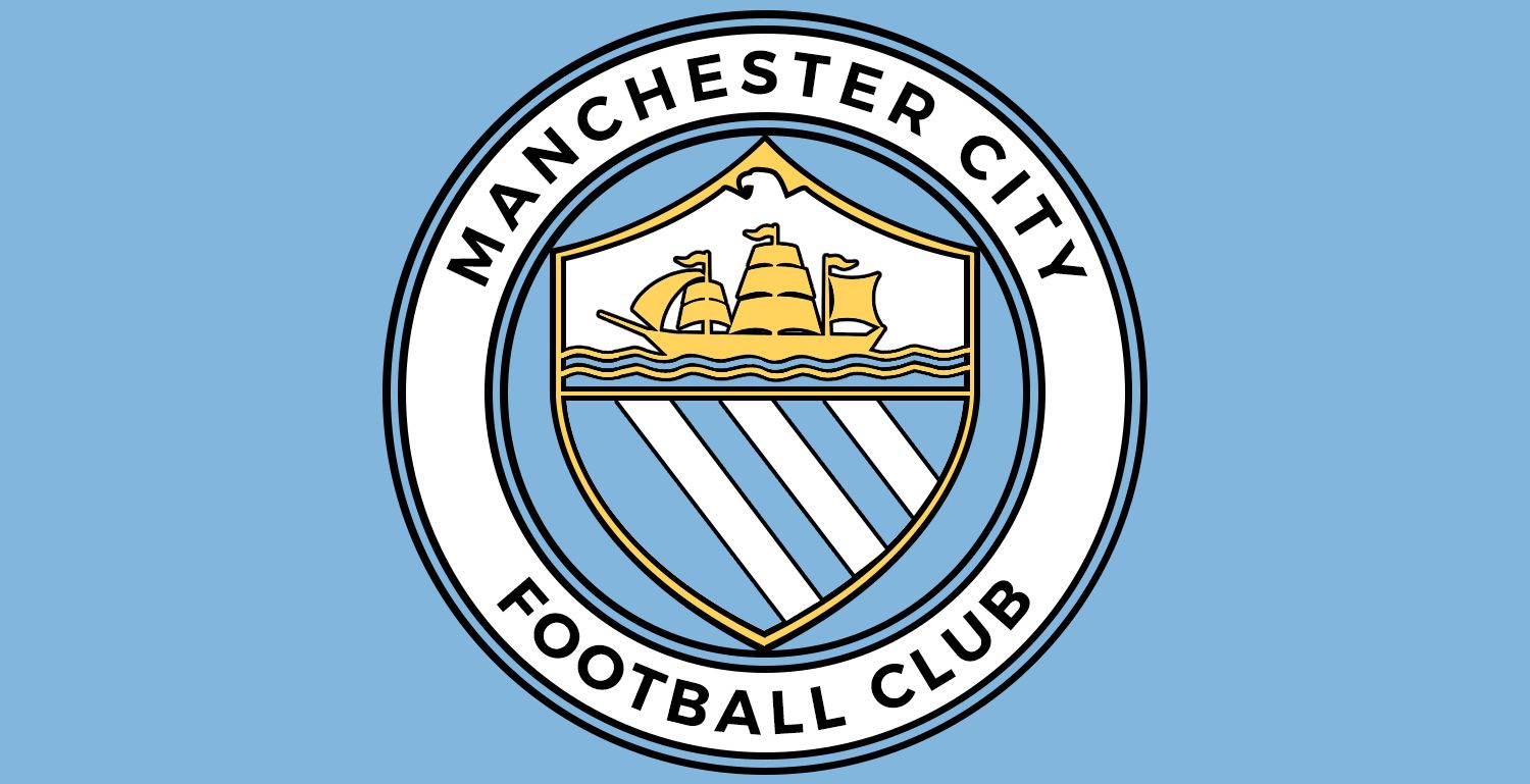
Club Badge (merged)

I think the one point that people are missing with the eagle is that the design of the Eagle could change dramatically. I found the following article which shows the change in London clubsclogos . The main thing is that all of them look cleaner and simplified. http://www.standard.co.uk/sport/foo...-of-londons-premier-league-clubs-9614501.html

bar chelsea all the old badges are better though palaces is alright. Still don't know why spurs cockrel is on a basketball nowadays
 
Ah I see the "Boring James Milner Brigade" are out in full force here(all 4 of them) against our "extravagant eagle", you see they like things simple with plain colours and no surprises... bless them. :)

The eagle is a joke; if you're going to have any animal on your crest it has to basically be a silhouette ala Chelsea's lion, not our detailed Pokemon-esque monstrosity.

Simplicity what seperates the stylish from the fashionable.
 
The eagle is a joke; if you're going to have any animal on your crest it has to basically be a silhouette ala Chelsea's lion, not our detailed Pokemon-esque monstrosity.

Simplicity what seperates the stylish from the fashionable.

I dont really rate Chelsea's lion personally, it looks deformed and skinny and un-liony(its holding a staff of some kind too... why?) and them red roses... it's a no from me. ;)

This has been going on for 6 month and there designs are to be sometime in January

6 Months? Jesus Navas... I had no idea that a badge could take that long.
 
Last edited:
zPt2qhi.gif


I could watch this forever

It was worth paying Adebayor £150k a week just for these five seconds of a Gif
 
City, have been really positive throwing open this consultation. I like the core elements of Rivers and Ship, they reflect both MCFC and the City of Manchester COA. My son, 24, loves the current badge, he's grown up with it and shows little affinity with the previous badges, whilst I am sure that view is strong amongst our younger fans I wouldn't want to generalise this as solely a generational issue. My brother, 46, who has followed City home and away since the 1980s doesn't want to change.

For information, my old boss was a big Chelsea Fan. The Lion on the Chelsea badge reflects a traditional emblem for Chelsea, it appears on the COA of London Borough of Kensington and Chelsea. The staff it holds is the staff of the Abbot of Westminster whose patch covers Chelsea (I suppose a bishop would have a crozier, an abbot a staff). The Roses, represent England and the Footballs need no explanation. It is a redesign that clearly looks at symbols that represent Chelsea FC and where it is based.

Whatever they come up with I agree with others on here that they can't shoehorn everything in. "I cannot give you the formula for success...but I can give you the formula for failure: Try to please everyone" (H Swope US Newspaper magnate)

Fingers crossed

Great post mate, and I totally agree, you can't please everyone. When you try to do that you end up pleasing no one.

The best we can hope for is a design that's popular with the majority, and that doesn't piss the remaining people off too much.
 
Anyone for a subtle eagle?


That is fucking beautiful!

It would be even better without the eagle's head, but the colour scheme is the best I've seen.

I think it needs something to break up the gaps on the side of the circle, whether simple dots, bees, 1894, roses whatever, but it needs something.

But the core design and colour scheme of this is absolutely spot on imo.
 
Great post mate, and I totally agree, you can't please everyone. When you try to do that you end up pleasing no one.

The best we can hope for is a design that's popular with the majority, and that doesn't piss the remaining people off too much.

Judging by the response of some posters on here you'd piss of loads of people if you
A.- keep the eagle
B.- don't keep the eagle

So what do we do we do?
 
That is fucking beautiful!

It would be even better without the eagle's head, but the colour scheme is the best I've seen.

I think it needs something to break up the gaps on the side of the circle, whether simple dots, bees, 1894, roses whatever, but it needs something.

But the core design and colour scheme of this is absolutely spot on imo.

Hahaha, the eagle bit was the main difference to all my other designs PMSL
 
Hahaha, the eagle bit was the main difference to all my other designs PMSL

Haha, the eagle just looks a bit awkward.

The other designs I've seen which I assume are yours have gold stripes on blue shield which personally I don't think works. Gold ship and shield outline, blue lower shield with white stripes is the one for me.
 

Don't have an account? Register now and see fewer ads!

SIGN UP
Back
Top