Metalartin
Well-Known Member
- Joined
- 15 Jul 2015
- Messages
- 12,442
Oh shut up you Eagle haters, you know it's staying and thats why you are being such a vocal minority and really some of you need to grow up... sheesh. I really hope it stays even more now because it will be funny watching you throw your toys out of your prams, plus it would be kind of karma for some of the attitudes shown.
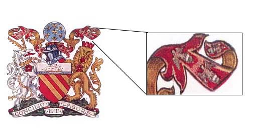
Nobody is contesting the rivers or the ship... whats the point of comparing it to that? What a desperate strawman that is. The eagle is a something people are split on 51% says more people want it, the only thing you could compare it to is the Red Rose(which not everyone is a fan of... myself included) which got 54% but even then thats not a huge difference.
If I'd have known about the poll I'd have voted for the eagle myself and no on the rose, those against seem more obsessed about getting rid of it than those that want to keep it. I think they will run some more polls between now and when it's announced, does it even say how many people voted?