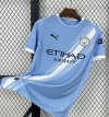
City’s New Kits

Wait until the comic book lightning bolt kit comes out. It’s one of the worst football shirts I’ve ever seen from any club.

I can forgive that on the basis of 3rd shirts intentionally being for the kids. And the colour scheme isn't particularly offensive.

The away shirt looks like old people's curtains. How do you screw up a white shirt? Our white kit from 21/22 is incredible.
 
I can forgive that on the basis of 3rd shirts intentionally being for the kids. And the colour scheme isn't particularly offensive.

The away shirt looks like old people's curtains. How do you screw up a white shirt? Our white kit from 21/22 is incredible.
I'm one of the few who actually liked last season's away kit (the red and black). And we wore it in one of the most important results on the road last season....


GettyImages-1488661601.jpg
 
I'm one of the few who actually liked last season's away kit (the red and black). And we wore it in one of the most important results on the road last season....


View attachment 84894
I didn't hate the shirt but I wasn't mad about the diagonal stripes. However the authentic version with stripes on the back, the yellow cup name/numbers and the full kit looked incredible onfield.
 

Don't have an account? Register now and see fewer ads!

SIGN UP
Back
Top
  AdBlock Detected
Bluemoon relies on advertising to pay our hosting fees. Please support the site by disabling your ad blocking software to help keep the forum sustainable. Thanks.