City's New Badge - Do You Like It?

I like the new badge, glad they stuck closely to the 'original'. Only gripe would be 'Manchester' at the top and 'City' at the bottom rather than 'Manchester City FC' around the edge.
 
Great badge, will look even better when surrounded by stars, to reflect our champions league victories ;-)
 
Great badge. Goes much better on freetime clothing as well. Think this year the whole clothing line is brilliant for that matter.
 
The badge is class, even my Rag mates have said it’s a big improvement.

Anyway for those who hate blue shorts, me included, we’ve got white shorts and navy socks next year, finally!!

And the shirt is blue with white trim, it sounds like a belting kit and probably our best nike one yet.
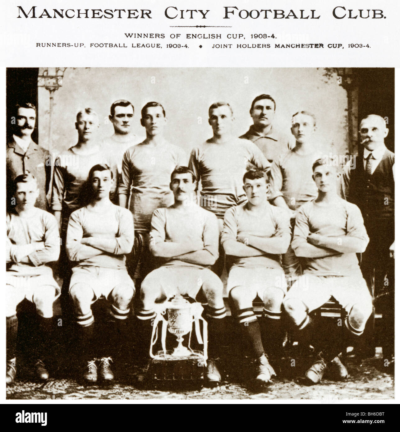
GET IN THERE! FINALLY!

Fucking well happy if that's true! Back to Manchester City's proper traditional club colours

manchester-city-1904-fa-cup-winners-team-photo-with-welsh-wizard-billy-BH6DBT.jpg
 

Don't have an account? Register now and see fewer ads!

SIGN UP
Back
Top
  AdBlock Detected
Bluemoon relies on advertising to pay our hosting fees. Please support the site by disabling your ad blocking software to help keep the forum sustainable. Thanks.