allan harper
Well-Known Member
- Joined
- 15 Jan 2009
- Messages
- 14,505
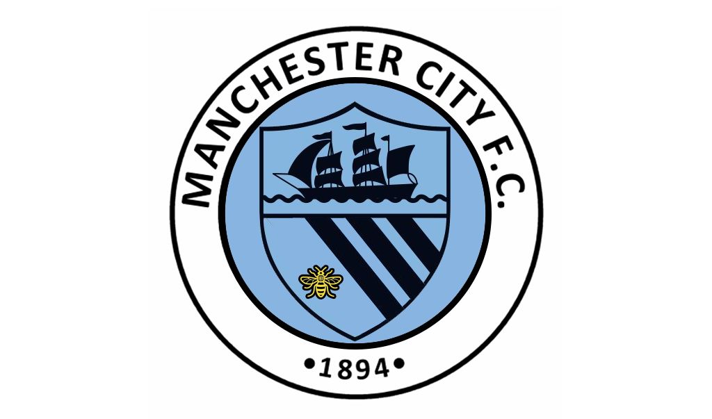
Stick a tiny bee on the ships flag!That bee looks totally out of place, its just been slapped on there.
Stick a tiny bee on the ships flag!That bee looks totally out of place, its just been slapped on there.
I think that's just because we haven't seen the options yet. The old badges do look incredibly dated, espeically to the younger audience, but we aren't going to just use the old ones, it will be an updated, modernised version, and when the kids see that they'll like them.
I'm not too worried to be honest. It's going to be round, it's going to have the shield, the ship and the 3 stripes on it and say MCFC or Manchester City FC. Given that design brief, it's going to be hard for any competent designer to fuck up too badly.
That bee looks totally out of place, its just been slapped on there.

"Our badge should be round
our badge should be round,
we're man city and our badge should be round"
Get this going people... I'll be singing this (on my own initially) tomorrow so please don't embaress me and sing along :D
I think it fits just as well as the old rose did
However in the interest of more designs... how about...
Posts like this. THIS is why I love this club.

I still like this one of Gav's
Maybe a bee on one side and a Maltese cross on the other instead of the two Maltese crosses?


If you want a bee, you need to incorporate it into the design from the start, you can't just place it on at the end and hope it works. Also not a fan of the colour plan.I think it fits just as well as the old rose did
However in the interest of more designs... how about...
]
this is what i would have, except have the manchester bee on one side instead of the cross. id change the dark navy blue to white and the ship to gold. as long as its this design id be happy.
Leave it how it is. perfect.
Why is everyone suddenly obsessed with us having a bloody bee.
Bee looks shite on every example I’ve seen. Let’s move on.
I love that one,has someone sent that to the club?Just seen this on a Mexican City fans Twitter

Where the hell is that I wonder?!
I like it!