Club Badge (merged)

I'm slowly warming to it. I still think it could've been better with a few minor alterations, but still a big improvement on the current monstrosity.

Can only assume anyone taking exception to it having red on it didn't follow us before 1997, as it featured on the badges prior to that. Seems ludicrous that anyone would have a problem with the red rose of Lancashire being, um, red.

Unless, of course, you don't agree with the rose being on there as we're no longer part of Lancashire, which is a perfectly valid argument. Taking exception to the colour alone is a bit petty though.
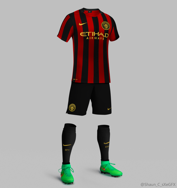
Just hope we go back to the Milan away kit next season.
 
I know that it is all about opinions etc. - and that everyone is entitled to theirs......

Mine is that for those banging on about the F.C. or Football Club being some major issue must just like moaning for the sake of it - probably just being dram queens and liking to take contrary views to be involved in debate.

There does not seem to be any substance to the points made to support this 'strong view' - just seems debate for the sake if it.

Also, compare the previous badges that have the 'extra letters/words' - just makes the badge cluttered. This version is much sharper about the words that are really relevant in 2016 - MANCHESTER and CITY.

Anyway that's my opinion to which I am entitled

Well that's a 'strong view' from someone who opposes anyone else 'banging on about it'.
I can't see how two little letters such as 'FC' on the badge would make it look cluttered at all to be honest.
In fact the badge looks empty without them.
In my opinion of course.
 
Well that's a 'strong view' from someone who opposes anyone else 'banging on about it'.
I can't see how two little letters such as 'FC' on the badge would make it look cluttered at all to be honest.
In fact the badge looks empty without them.
In my opinion of course.

I saw the three 'City Group' badges together somewhere, and they are all pretty much identical (obv different inner patternsand stuff), but i was glad to see our logo was unique in that it didnt say 'football club', like the new york and Melbourne badges, makes ours stand out more and makes it less formulaic.
 
I know that it is all about opinions etc. - and that everyone is entitled to theirs......

Mine is that for those banging on about the F.C. or Football Club being some major issue must just like moaning for the sake of it - probably just being dram queens and liking to take contrary views to be involved in debate.

There does not seem to be any substance to the points made to support this 'strong view' - just seems debate for the sake if it.

Also, compare the previous badges that have the 'extra letters/words' - just makes the badge cluttered. This version is much sharper about the words that are really relevant in 2016 - MANCHESTER and CITY.

Anyway that's my opinion to which I am entitled
You'll be dropping the 'fc' from your username then?

;-)
 
I'm slowly warming to it. I still think it could've been better with a few minor alterations, but still a big improvement on the current monstrosity.

Can only assume anyone taking exception to it having red on it didn't follow us before 1997, as it featured on the badges prior to that. Seems ludicrous that anyone would have a problem with the red rose of Lancashire being, um, red.

Unless, of course, you don't agree with the rose being on there as we're no longer part of Lancashire, which is a perfectly valid argument. Taking exception to the colour alone is a bit petty though.

Said from the off that it's not perfect - although I can't define perfect in this case - but it's fine. When you see the percenatge of votes certain elements received and read some of the complaints, you start to realise how much the designer(s) got right.

All the stuff about it not having football club or FC on the badge is my idea of a fuss about nothing and, imo, shortsighted.

As someone born in Manchester in the 60's, I consider myself to be from Lancashire (2nd to MCR of course) and grew up with the rose on the City badge so I voted to have it on there; IIRC, 60% of those that took part in the badge survey did, so it is there with good reason.

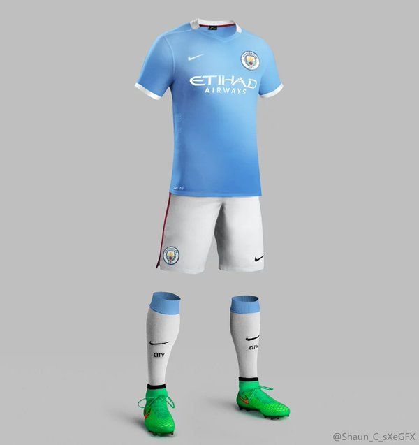
I just hope that the team's future shirts feature a properly embrodered version of the new badge. The next home shirt surely has to be a throw back, round white collar, plain sky blue body and the club badge in the middle, so as to introduce the new badge properly.
 

Don't have an account? Register now and see fewer ads!

SIGN UP
Back
Top
  AdBlock Detected
Bluemoon relies on advertising to pay our hosting fees. Please support the site by disabling your ad blocking software to help keep the forum sustainable. Thanks.