Club Badge (merged)

Why is everyone moaning about it being "too recent" and "the brand"? Recent is awesome and all City fans should want it too feel somewhat that way(old 'AS WELL AS' new remember?) Also like it or not every City fan owes CFG or at least the owners of it a heck of a lot of gratitude, so lets not start being ungrateful/resentful cretins about them having their say on it too.

I get the feeling every city fan over 40 wants it purely old school nothing new about it "like the good old days"... these ARE the good times though, so enjoy them and stop moaning for pity's sake.

I think that badge I linked to(which I believe Soriano himself tweeted) might be the one they take inspiration from the colour scheme fits City's as well as fitting well alongside the NYCFC badge best of both worlds IMO.
 
Last edited:
Correct, the club don't need to do owt. They don't need to pay a shed load to get designers or Nike or owt, just get Gav in and say "right we'll pay you 0.5% of all merchandise sold with your badge design on forever and we'll use that".

see .... we have a problem right there ..... i was greedy and thinking 2.5% .... 0.5% to me (well the family), 1% to The Stroke Association and 1% towards a City Scholarship Program for kids with disabilities to get any special education requirements and support for City families that cant afford it or struggle.

oh ....

and maybe an executive box at The Etihad for my Uncle and Brother for a season.

oh .....

and the crowd to say "Hi Gav!" on 77 minutes waving to the sky and kissing the badge I made them .....

Heaven!!
 
Last edited:
Just read this on City Voice, which is an official statement from the club:

"Please note that this process is about understanding the views of fans and we are not accepting any unsolicited badge designs. If, as a result of the consultation, the badge does evolve, the Club's in-house designers will undertake this process. ."

The bit in bold is a bit of an area of concern for me. The badge should be designed by a specialist in my view, not just someone from the in house team. The in-house team's previous effort wasn't the best.

GeekInGav:
xPU1aT.jpg


Rafael Esquer:
nycfc_badge.jpg


City's "In-house" design team:
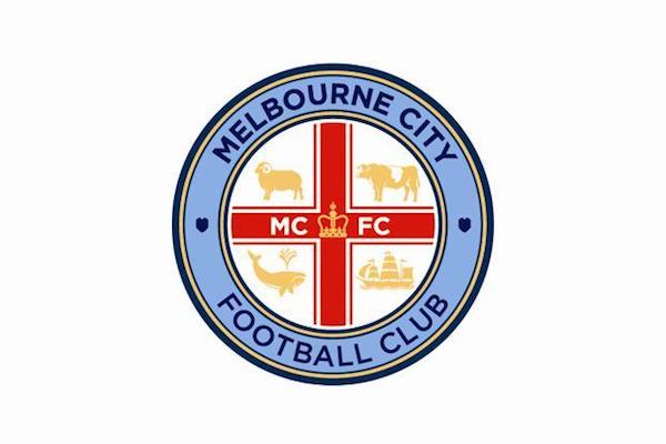
Melbourne-City-FC-logo-badge-crest-600w.jpg


Not really of the same standard.

The Melbourne badge is piss-poor. It's embarrassingly bad tbh. A ten yr old kid must have thought fuck it, let's have a whale on it whilst we're at it. It's complete gash.

Geekingav should be on the panel. His designs are by far the best imho.
 
You know I love your designs Gav, and I totally agree with you on this! The colour scheme on your 'glass door' one with the black (or is it navy?) circle with white lettering, if people saw that not on a glass door, but perhaps on a blue football shirt, they wouldn't like it half as much. Conversely, if some of the other colourways you've done i.e white circle with navy lettering, was on the glass door, people would rave about that one the most.

Because the glas door one looks so realistic, it's easy for people to visualise it being a real badge as opposed to a graphic on a computer. But if there was 5 different colour schemes offered to fans, I don't think the black / navy circle would end up being the most popular one.

exactly, but the club need a design that is dynamic and versatile to be used in so many different ways .... not just the original form, but in inverse, monochrome, glass, other varing colour schemes and techniques so it becomes a club badge but is also a commercial weapon.
 
WTF I'd assumed Rafael had done Melbourne's as well since it's the same idea. We're one of the richest clubs in the world and we're using someone in the office that knows how to use photoshop - f*ck that!

to be fair .... that's basically me lol
 
The Melbourne badge is piss-poor. It's embarrassingly bad tbh. A ten yr old kid must have thought fuck it, let's have a whale on it whilst we're at it. It's complete gash.

Geekingav should be on the panel. His designs are by far the best imho.

That badge could have been made on paint - They have literally copied and pasted the ship of the City badge on to the Melbourne one. The worst bit is the inclusion of both MCFC and Melbourne City Football Club.

The two best City related badges I've seen are one of Gav's (the one on the window) and the NYCFC one - both designed by fans.
 
Just read this on City Voice, which is an official statement from the club:

"Please note that this process is about understanding the views of fans and we are not accepting any unsolicited badge designs. If, as a result of the consultation, the badge does evolve, the Club's in-house designers will undertake this process. ."

The bit in bold is a bit of an area of concern for me. The badge should be designed by a specialist in my view, not just someone from the in house team. The in-house team's previous effort wasn't the best.

Oh no, it's going to be cringe worthy isn't it?

A blue moon with a couple of bananas in the middle with We are Cityzens around the outside is my bet.
 
Yeah, navy shorts and socks for a couple of seasons, it's hardly a traditional part of our kit yet now it seems to be part of the "brand".

60+ years with Navy as part of the kit.....I'd say that's pretty traditional???
 
That badge could have been made on paint - They have literally copied and pasted the ship of the City badge on to the Melbourne one. The worst bit is the inclusion of both MCFC and Melbourne City Football Club.

The two best City related badges I've seen are one of Gav's (the one on the window) and the NYCFC one - both designed by fans.

lets take a moment and breathe ............

1. i havent done anything. i've based mine on the template of the NYCFC and MelCFC badges because i'm 96% certain thats where ours it going. So to help folks visually things better, i just used elements from past City badges , tried different colours to see what works and what doesnt. Trial and Error if you will, not design skill.

2. Melbourne City Badge. Fits in with the brand where ours it going into, the centerpiece is exactly what it should be for Melbourne because of its history of Whaling and Goating and whatever is on there. We might not think its all that, but we arent from ther, it may be perfect for them.

so wait and see what we get and then we'll have another debate for 30 years to change it then lol
 
to be fair .... that's basically me lol
But in our position I think we should be shelling out for the expertise who does this thing day in day out when it's regarding the most important aspect to the identity of the club besides our home colours. It's not just about being able to mock up a design, it's about fitting the criteria into a design in the best way possible to have the best result - that's where Rafael should come in due to his expertise of shapes and colour schemes and what not.
 
But in our position I think we should be shelling out for the expertise who does this thing day in day out when it's regarding the most important aspect to the identity of the club besides our home colours. It's not just about being able to mock up a design, it's about fitting the criteria into a design in the best way possible to have the best result - that's where Rafael should come in due to his expertise of shapes and colour schemes and what not.

without doubt, definitely not me ... but the guys we have at City are top notch media, art and design professionals, of that i have no doubt or worries, and a good bunch of them are City fans so know what is needed..
 

Don't have an account? Register now and see fewer ads!

SIGN UP
Back
Top