Melbourne City FC Thread

Re: Melbourne City FC

sir peace frog said:
TonyM said:
invisableman said:
With the badge being the same template as nycfc will we be changing ours?
Hope not I love ours .. might be in the minority though :-)
nothing wrong with our badge,bluemoon is full of don't like crest,dont like shorts don't like the neck,dont like the shield,dont like socks,dont like pattern of pitch,dont like pellegrini ,don't like mancini,,dont like this that and the other,bluemoon is full of spoilt fuckers who need to don't like something,but everybody has an opinion,and this is mine .


I'd say if you did a poll on match day with attending fans..I reckon at least 80% would favour one of our old badges to the current one
 
blueparrot said:
This part of the statement on the o/s did make me smile Good of us to meet them halfway.

"The new Home Kit for Melbourne City FC combines the white from the Club’s previous kit designs with the signature blue of its sister clubs in Manchester and New York. "
Only because Sydney objected to all blue and their FA upheld it.
 
Re: Melbourne City FC

sir peace frog said:
TonyM said:
invisableman said:
With the badge being the same template as nycfc will we be changing ours?
Hope not I love ours .. might be in the minority though :-)
nothing wrong with our badge,bluemoon is full of don't like crest,dont like shorts don't like the neck,dont like the shield,dont like socks,dont like pattern of pitch,dont like pellegrini ,don't like mancini,,dont like this that and the other,bluemoon is full of spoilt fuckers who need to don't like something,but everybody has an opinion,and this is mine .

Off the Melbourne CIty web site.

"The Melbourne City FC badge draws its inspiration from the heritage of Melbourne while celebrating modern day aspects of the Victorian economy, society and environment. The central red and white component of the badge ensures that the Club’s foundation colours will always be an integral part of its identity."


I think we all know the bold bit above is bollocks to the point of being embarassing...
nycfclogo315.jpg
mbcfclogo315.jpg
 
I don't like this franchise shit - the lazy badge copying has killed it for me. Supporting a football club is more than just supporting a team play week in week out, it's something unique you identify with. It would have been easy to come up with a simple badge that incorporated the Melbourne flag. Now we are at the forefront turning football clubs into primarily business interests
 
Sigh said:
We just need to get rid of the devil chicken crest now and, with a tweak, bring MCFC into-line with NYCFC and the other MCFC.
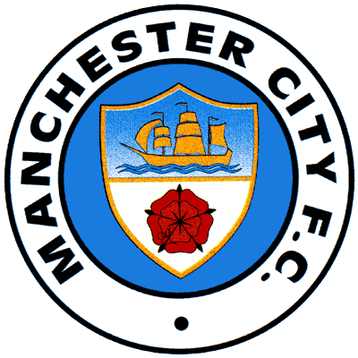
Old-manchester-city-logo.png

Tbf, I just want this. Not massively sold on a replica of the NYC badge. Would rather the current one or preferably the classic emblem above.
 
Re: Melbourne City FC

DiscoSteve said:
sir peace frog said:
TonyM said:
Hope not I love ours .. might be in the minority though :-)
nothing wrong with our badge,bluemoon is full of don't like crest,dont like shorts don't like the neck,dont like the shield,dont like socks,dont like pattern of pitch,dont like pellegrini ,don't like mancini,,dont like this that and the other,bluemoon is full of spoilt fuckers who need to don't like something,but everybody has an opinion,and this is mine .

Off the Melbourne CIty web site.

"The Melbourne City FC badge draws its inspiration from the heritage of Melbourne while celebrating modern day aspects of the Victorian economy, society and environment. The central red and white component of the badge ensures that the Club’s foundation colours will always be an integral part of its identity."


I think we all know the bold bit above is bollocks to the point of being embarassing...
nycfclogo315.jpg
mbcfclogo315.jpg

Oh dear...

melbourn.jpg
 

Don't have an account? Register now and see fewer ads!

SIGN UP
Back
Top
  AdBlock Detected
Bluemoon relies on advertising to pay our hosting fees. Please support the site by disabling your ad blocking software to help keep the forum sustainable. Thanks.