mannion18
Well-Known Member
jimharri said:To be fair, you have a point. However;mannion18 said:I know that i am going to come across as abit of a dick here, but oh well.
Do people enjoy watching the team currently put out that has cost millions?
We are all ment to do our bit to help finance this team.
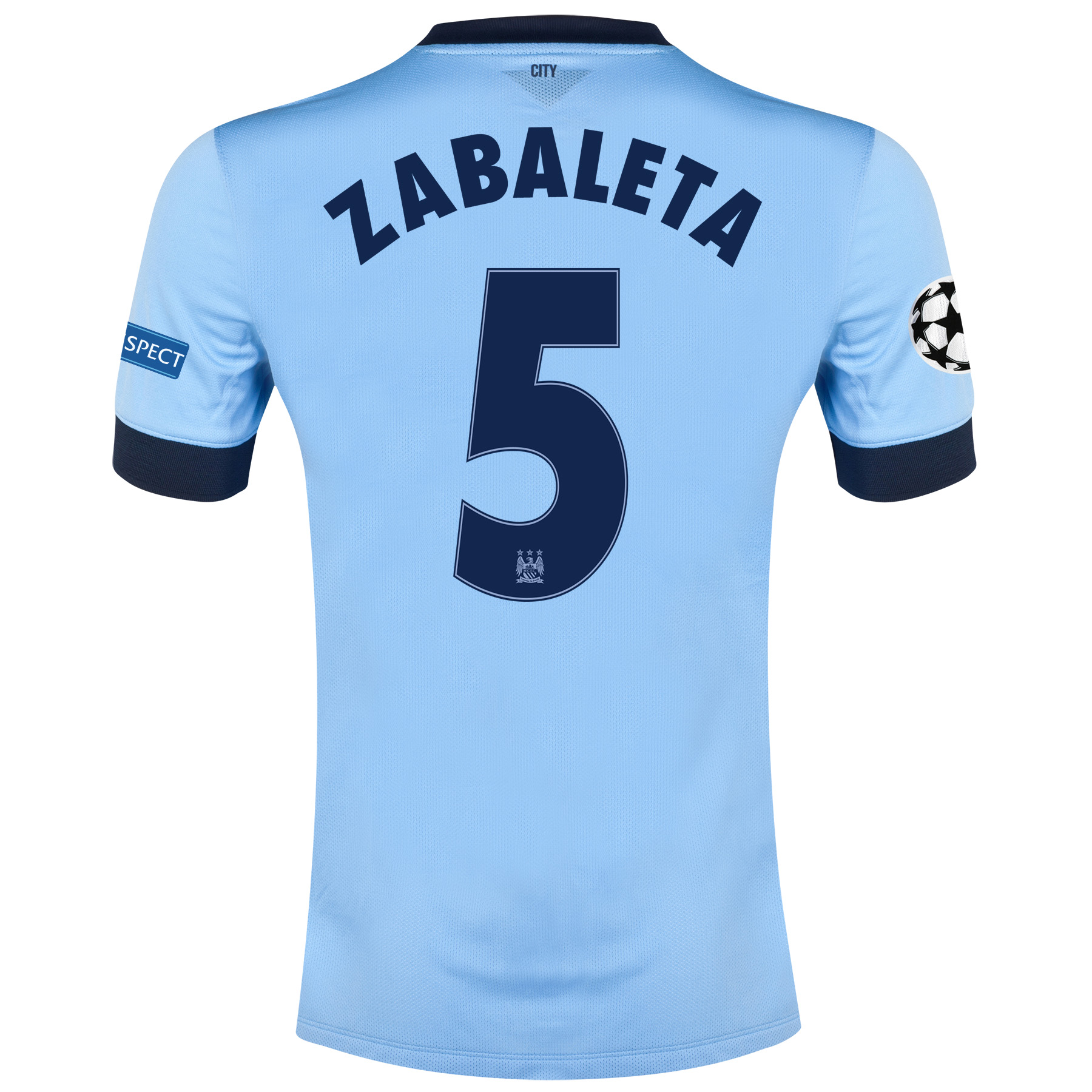
Tickets, beers, pies and SHIRTS.
So why do so many people promote where they are buying their fake shirts from?
You might think your £55 might not matter but it all adds up.
Or which could be the case, am i missing something? Do city not recieve £ from the sales of these shirts or from nike who make the shirts?
A. Some folks simply can't afford the cost of a genuine replica shirt. If a father has a couple of young kids (who wouldn't be old enough to appreciate that they are wearing fakes) and they want this year's shirt, what is he to do? And
B. In these megabucks days, they (yep; them again) reckon that even ticket revenue forms a small percentage of a top 4 club's overall income. Take City, for instance. For your average home game, we'll average around 45k at an average ticket price of, what, £40-50? That would amount to £1.8m - £2.5m. How many lost shirt sales would that equate to (not sure what cut the club gets from each £55 shirt; a tenner, maybe?). That's between 180 -225k potential replica shirts out there; highly unlikely. Sponsorship, corporate hospitality, TV rights, CL prize money and yes, to a small degree, merchandising all make up the vast bulk of a club like City's revenue. Let's just say, I don't think it's all about to go tits up due to those replica shirts floating around!
Whilst i understand what you are saying, my parents made me realise from
A young age how much these shirts were and if i wanted one it would be for birthdays or christmas & they would not have bought me one drom "del boy" down the market.
I know its not going to make much of a difference to our bottom line but why should the club spend so much if some fans are not willing to buy all things city from city? We would be the 1st to complain (& we have many times) if they decided to save afew quid and buy a second rate player.
There will be the counter argument about spending enough at city and that is fair enough, but why encourage others to spend less on legit merchandise? If people want fakes im sure they have the ability to find them themselves.