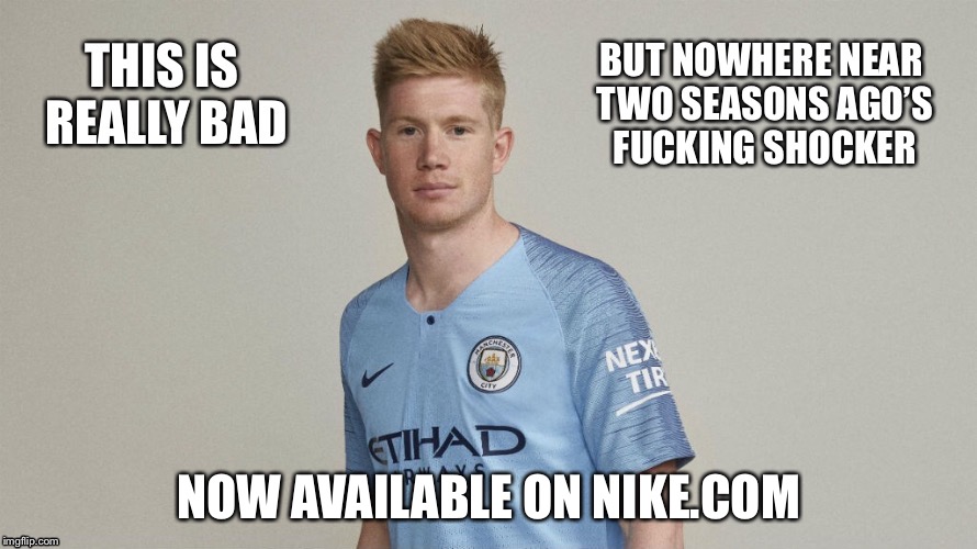
I'd say these two were worse than the new one shirt wise.
PMSL at the Le Coq effort by the way. You'd have to go out of your way to design something that bad!


Yep much worse
I'd say these two were worse than the new one shirt wise.
PMSL at the Le Coq effort by the way. You'd have to go out of your way to design something that bad!
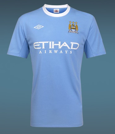

I'd say these three were worse than the new one shirt wise.
PMSL at the Le Coq effort by the way. You'd have to go out of your way to design something that bad!

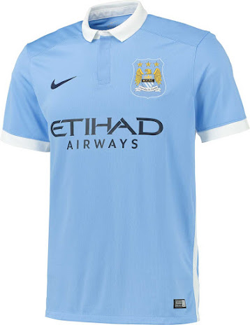
I present to you guys the best three City home shirts of the Premier League era.

See, the problem there is that they’ve left off the arms.
I present to you guys the best three City home shirts of the Premier League era.
Hmmm...Shouldn’t always look back. We should always come up with a new kit so that in a generation’s time they can have a retro kit of that one come out
I present to you guys the best three City home shirts of the Premier League era.
I don’t mind the third kit being a bit different, but we need to establish the home and away kits as “City” kits. My vote would be black and red vertical stripes for the away kit and something a bit funky for the third would be fine. That said, everyone I know LOVES the white with double striped sash as an away kit...but is it too similar to the home kit?Don’t hold your breath. One of the away kits is bright orange I think?
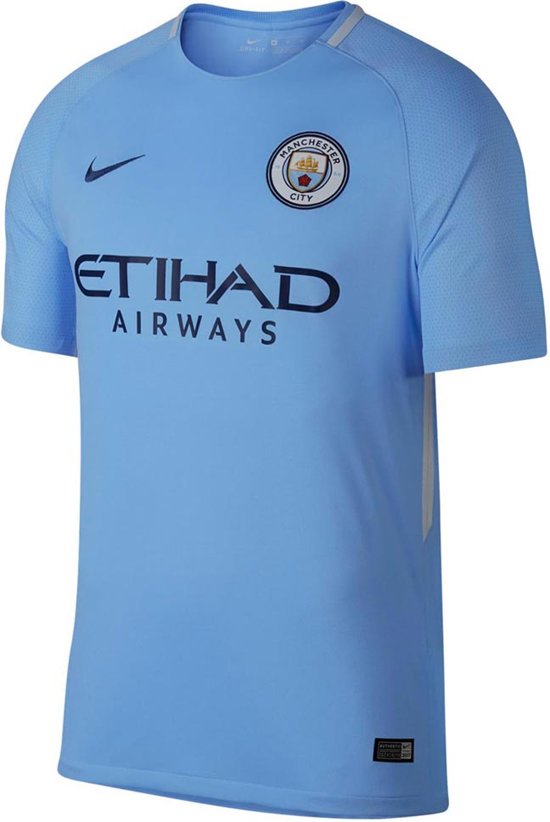
I am not ashamed to say I have that on right now (one of the benefits of working from home).Swap the nike one for this one
Proper collar and cuffs, and only one shade of blue.
The 2 umbro ones are the best we have had since 94
Yeah, but what about the kit?2010/11 is a thing of beauty
Haha nice one mateHow do you already know Nike’s marketing campaign for this shirt? Do you work there?
Leaks, leaks everywhere!
The top one with white cuffs & our new badge would be perfection :)The 2006/07 kit is just awful, with blue fucking shorts to match.
At least it matched the team at the time I suppose.

Sort it out Gav.
The top one with white cuffs & our new badge would be perfection :)
has anyone ever bought the vapour team quality shirts? are they much better quality than the fan version?