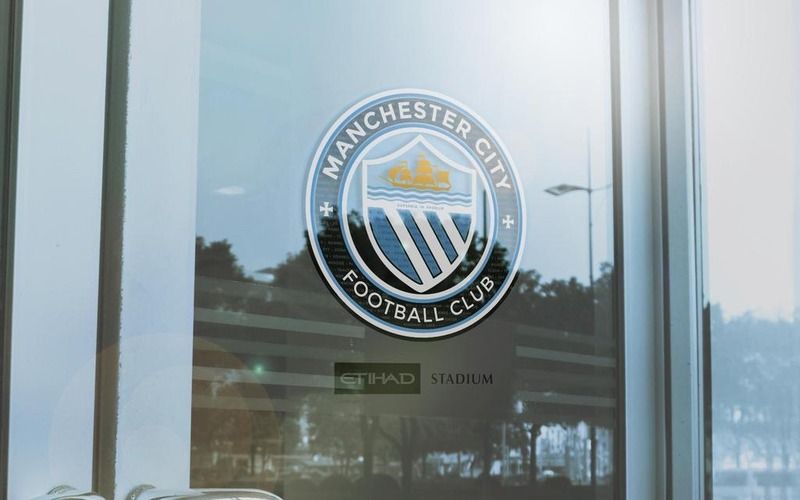
Club Badge (merged)

I think that's just because we haven't seen the options yet. The old badges do look incredibly dated, espeically to the younger audience, but we aren't going to just use the old ones, it will be an updated, modernised version, and when the kids see that they'll like them.

I'm not too worried to be honest. It's going to be round, it's going to have the shield, the ship and the 3 stripes on it and say MCFC or Manchester City FC. Given that design brief, it's going to be hard for any competent designer to fuck up too badly.

dont agree with that. Ive only ever known the eagle badge and i think it looks crap, very poorly designed. I actually prefer to buy the older shirts and i think the older badges are so much better designed. Its about tradition and we need to keep that.

the new badge has to have, the maltese cross, manchester bee, manchester city in full and it would be great. just use the old badges if not.
 
I think it fits just as well as the old rose did

However in the interest of more designs... how about...


i dont like the colour scheme on that and the bee doesn't work there. id have it like one of the earlier badges i saw. the maltese cross on one side and the bee on the other.
 
Current shield with 3 stripes in round old style badge, bees could be added to outer rim or replace MCFC in centre ban as won be needed with Manchester City FC on outer rim.

Be glad to see back of Eagle and Stars
 
d7490571ecc6e90ef0ad01197410cd41.jpg

I still like this one of Gav's
Maybe a bee on one side and a Maltese cross on the other instead of the two Maltese crosses?

This one for me
 
]
h0TdAIv.png

10f2tyd.jpg


this is what i would have, except have the manchester bee on one side instead of the cross. id change the dark navy blue to white and the ship to gold. as long as its this design id be happy.
 
Whatever about merchandise, what about (as a radical thought) a badge-free shirt?

Manchester-City-team-phot-008.jpg


THAT was a classy kit. I know there's fuck all chance of it actually happening. It's just a thought, like.
 
I think it fits just as well as the old rose did

However in the interest of more designs... how about...

If you want a bee, you need to incorporate it into the design from the start, you can't just place it on at the end and hope it works. Also not a fan of the colour plan.
 
Can't see them having the letters MCFC and words Manchester City in the same badge.

Looks like the owners will go with a circular one to match New York/Melbourne branding scheme.

I agree with the earlier poster, we represent the City ,not Lancashire, if it's a choice of the stripes or the red rose then it's the stripes every time imo, it's in our very name "CITY", it isn't difficult.

IF the red rose goes in there , 1 small Maltese cross on one side of the circle, the red rose on the other.
 
Does anybody understand why the previous badge was ineligible for registration as a trademark and what about the one before that was that also ineligible and having said that is it possible to get round this any way surely deals can be done and routinely are in these areas . . . Anybody know anything about trademarks
 
one thing I'm already noticing o nothings like Facebook and twitter is all the glory hunters, slating the older badges and only accepting the newer one. I hope its just season ticket holders or people with a history of games get to choose.
 
10f2tyd.jpg


What makes this work is the nice clear lettering / font. St Marks cross and simple crest in the middle. I like the colour scheme as well, simple Navy and Sky blue with white and the ship in gold. Doesn't need a bee. I think i can see lettering in the middle line of the crest but that would go for any small versions. The NYCFC badge has many of the same characteristics.

 
Last edited:

Don't have an account? Register now and see fewer ads!

SIGN UP
Back
Top