nijinsky's fetlocks said:
I'd be interested to hear just what that 'good case' was, other than maybe flogging a few more overpriced and badly designed Nike replica shirts to newbie fans in Kuala Lumpur.
I'm sure some focus group had a high-powered meeting, where plenty of blue-sky thinking was doing the rounds as folk ran ideas up the flagpole and saw who saluted, after drawing deep from the well of inspiration.
Or some such utter corporate gobbledygook.
Am not saying your opinions are wrong at all but the current crest wasn't entirely the result of corporate wankers.
Last year I did some research on Manchetser for a presentation and found out the following regarding the crests (I am no historian so I am not stating the following as 100% correct):
This is what I wrote for the slide as part of my presentation:
- - - - - - - - - - - - - - - - - - - - - - - - - - - - - - - - - - - - - - - - - - - - - - - - - - - - - - - - - - - - - - - - - - - - - - - - - - - - - - - - - - - - - - - - - - - - - - - -
Originally known as St. Mark’s (West Gorton) Football Club, Manchester City was formed in 1894. The club has experienced highs and lows throughout its history but has always been the only football team to come from Manchester.
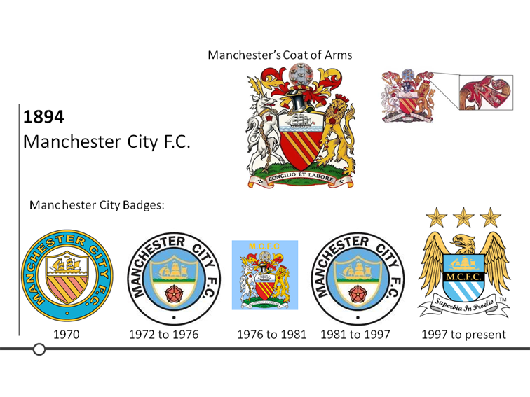
This can be demonstrated in it’s various badges which have always linked to the Manchester Coat of Arms.
In the 1970 badge it includes the shield with the three stripes golden stripes and ship. A common myth is that the three stripes represent Manchester’s three rivers Irwell, Irk and Medlock. However according to the council their is no historical evidence to back this up. All indications are that simply the three golden stripes and the red shield were applied to the crest by the de Grelley family in the 13th centenary. Also, another myth is that the ship is sailing on the Manchester Ship Canal. The ship was added to the crest in 1842 but the ship canal became a reality in the 1880’s. The reason why the ship was introduced was to show Manchester’s trade links to the world.
City then changed the badge in 1972 by removing the de Grelley family shield. It kept links to the coat of arms by including the Lancashire Red Rose at the bottom of the shield.
From 1976 to 1981 City used the Manchester Coat of Arms as its badge. In 1981 the club reintroduced the 1972 badge which it kept till 1997. City legend and chairman at the time Francis Lee then modernised the badge. Apparently this had to be done because City did not own any rights to the 1972 badge.
For the current badge the shield remained but with a similar shape to that of the Coat of Arms. Due to Manchester no longer being part of Lancashire the red rose has removed and the de Grelley family shield has been reintroduced but gone is the ghastly ‘gules’ colour which has been replaced by with sky blue. The ship has remained and now floats above the initials M.C.F.C. displayed in gold. A significant new part of the badge is the introduction of the golden eagle which is linked to the Coat of Arms. In 1958 the first official crest displayed a golden eagle on top of a crown. The eagle and crown were displayed within the mantel, as highlighted in the top right of the slide. The golden eagle represents the importance of the aero industry and the crown the englarging community of Manchester. Due to modern uses of the Coat of Arms the eagle along with other elements had to be removed. City brought back the golden eagle and included three stars above it for decoration. The badge also took inspiration from the Coat of Arms Latin motto ‘Concilio et Labore’ which translates as ‘Wisdom and Effort’. For City’s Latin motto the club chose ‘Superbia in Proelio’ which translates as ‘Pride in Battle’.
- - - - - - - - - - - - - - - - - - - - - - - - - - - - - - - - - - - - - - - - - - - - - - - - - - - - - - - - - - - - - - - - - - - - - - - - - - - - - - - - - - - - - - - - - - - - - - - -