A club crest we can all agree on..

Tron Coltrane said:
I've never been more disappointed than I am right now. A thread that began with sheriff stars and a drinking pigeon (congrats on that by the way, it's art in every sense of the word) has descended into a serious discussion on the club's crest. To quote the late, great Rodney Dangerfield, I feel like I've gone to a boxing match where a hockey game has broken out.

pmsl
 
Manchester1894 said:
eti74g.jpg
I prefer Sambas myself.
 
Oh go on give us a circular badge once again...

Not saying we should adopt one of the ones we've already had but come on, if only to make the shirt less cringy to look at... talking about THE SHIELD ofc.
 
IrelandSuperman said:
Oh go on give us a circular badge once again...

Winner winner chicken dinner.
We should never have fucked about with the old badge in the first place, with all this fucking daft eagle and tacky stars and crap made up Latin motto shite.
The Manchester coat of arms and our name on it is all we need to let folks know that we are the only football team from our city.
 
nijinsky's fetlocks said:
We should never have fucked about with the old badge in the first place
As I understand it there was a good case for "fucking about" with it, but the end result is overdesigned, hollow, kitschy crap that has very little in connection with our 'istree.

Still, I hasten to add, I wear it with pride, for what it represents, and among non-City fans, will defend it to the death. Among fellow Blues, though, I will admit it's a bit shit.
 
IrelandSuperman said:
nijinsky's fetlocks said:
We should never have fucked about with the old badge in the first place
As I understand it there was a good case for "fucking about" with it

I'd be interested to hear just what that 'good case' was, other than maybe flogging a few more overpriced and badly designed Nike replica shirts to newbie fans in Kuala Lumpur.
I'm sure some focus group had a high-powered meeting, where plenty of blue-sky thinking was doing the rounds as folk ran ideas up the flagpole and saw who saluted, after drawing deep from the well of inspiration.
Or some such utter corporate gobbledygook.
 
GeekinGav said:
dobobobo said:

Exactly that! I've not been a member for years but I still have my supporters keyring (and still use) with the current crest on it. If your crest was on it, it would make it a lot more treasurable because it is individual and a timeless design.

City already own it technically, its modified from the NYCFC crest, fused with elements of City past and present.

familysmall_zps37d49be8.jpg

Pfft! Typical City ruining it! Accoring to what I have read on t'internet City don't have a clue about ownership anyway! (Apparently, the 1972 badge (one with the Lancashire Rose) wasn't actually owned by City so Mr Lee sorted out getting the current crest.) Plus, until I see evidence that City and t'Council have permission from the de Grelley family to use their shieled I say fuck 'em!
 
GeekinGav said:
warpig said:
I used to be pro-return to the old badge, but as we have won everything in my life time with the new one, I'm happy for it to stay as it is. I don't know about other people, but personally it has really grown on me the last couple of seasons. the same as the ethihad, is really starting to feel like 'home' now.

yeah i aint fussed now, just still dont know what the 3 stars are meant to mean, just looks better without them i guess

The stars are for pure decoration. The rest of the symbols have an origin.
 
nijinsky's fetlocks said:
IrelandSuperman said:
nijinsky's fetlocks said:
We should never have fucked about with the old badge in the first place
As I understand it there was a good case for "fucking about" with it

I'd be interested to hear just what that 'good case' was, other than maybe flogging a few more overpriced and badly designed Nike replica shirts to newbie fans in Kuala Lumpur.
I'm sure some focus group had a high-powered meeting, where plenty of blue-sky thinking was doing the rounds as folk ran ideas up the flagpole and saw who saluted, after drawing deep from the well of inspiration.
Or some such utter corporate gobbledygook.

Am not saying your opinions are wrong at all but the current crest wasn't entirely the result of corporate wankers.

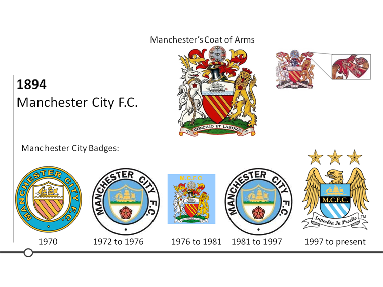
Last year I did some research on Manchetser for a presentation and found out the following regarding the crests (I am no historian so I am not stating the following as 100% correct):

BlueMoonversion.png


This is what I wrote for the slide as part of my presentation:

- - - - - - - - - - - - - - - - - - - - - - - - - - - - - - - - - - - - - - - - - - - - - - - - - - - - - - - - - - - - - - - - - - - - - - - - - - - - - - - - - - - - - - - - - - - - - - - -
Originally known as St. Mark’s (West Gorton) Football Club, Manchester City was formed in 1894. The club has experienced highs and lows throughout its history but has always been the only football team to come from Manchester.

This can be demonstrated in it’s various badges which have always linked to the Manchester Coat of Arms.

In the 1970 badge it includes the shield with the three stripes golden stripes and ship. A common myth is that the three stripes represent Manchester’s three rivers Irwell, Irk and Medlock. However according to the council their is no historical evidence to back this up. All indications are that simply the three golden stripes and the red shield were applied to the crest by the de Grelley family in the 13th centenary. Also, another myth is that the ship is sailing on the Manchester Ship Canal. The ship was added to the crest in 1842 but the ship canal became a reality in the 1880’s. The reason why the ship was introduced was to show Manchester’s trade links to the world.

City then changed the badge in 1972 by removing the de Grelley family shield. It kept links to the coat of arms by including the Lancashire Red Rose at the bottom of the shield.

From 1976 to 1981 City used the Manchester Coat of Arms as its badge. In 1981 the club reintroduced the 1972 badge which it kept till 1997. City legend and chairman at the time Francis Lee then modernised the badge. Apparently this had to be done because City did not own any rights to the 1972 badge.

For the current badge the shield remained but with a similar shape to that of the Coat of Arms. Due to Manchester no longer being part of Lancashire the red rose has removed and the de Grelley family shield has been reintroduced but gone is the ghastly ‘gules’ colour which has been replaced by with sky blue. The ship has remained and now floats above the initials M.C.F.C. displayed in gold. A significant new part of the badge is the introduction of the golden eagle which is linked to the Coat of Arms. In 1958 the first official crest displayed a golden eagle on top of a crown. The eagle and crown were displayed within the mantel, as highlighted in the top right of the slide. The golden eagle represents the importance of the aero industry and the crown the englarging community of Manchester. Due to modern uses of the Coat of Arms the eagle along with other elements had to be removed. City brought back the golden eagle and included three stars above it for decoration. The badge also took inspiration from the Coat of Arms Latin motto ‘Concilio et Labore’ which translates as ‘Wisdom and Effort’. For City’s Latin motto the club chose ‘Superbia in Proelio’ which translates as ‘Pride in Battle’.
- - - - - - - - - - - - - - - - - - - - - - - - - - - - - - - - - - - - - - - - - - - - - - - - - - - - - - - - - - - - - - - - - - - - - - - - - - - - - - - - - - - - - - - - - - - - - - - -
 
IanBishopsHaircut said:
The stars would be enough for me..lose them and I'd be happy

I hate the shite latin phrase in the white ribbon just as much as the stars.

The eagle isn't too bad & the middle bit is ace.
 
I like the 3 rivers and ship canal 'myth'. I always tell everybody else that [as well as my kids], mostly so that I can get my 'Didn't trust the scousers to unload the ships' joke in.

So I am sticking to it. Fuck fact and history, We make our own.

And I wish we'd stuck with the old badge but it's too late now and I think that the new badge forevermore now. So be it.
 
dobobobo said:
nijinsky's fetlocks said:
IrelandSuperman said:
As I understand it there was a good case for "fucking about" with it

I'd be interested to hear just what that 'good case' was, other than maybe flogging a few more overpriced and badly designed Nike replica shirts to newbie fans in Kuala Lumpur.
I'm sure some focus group had a high-powered meeting, where plenty of blue-sky thinking was doing the rounds as folk ran ideas up the flagpole and saw who saluted, after drawing deep from the well of inspiration.
Or some such utter corporate gobbledygook.

Am not saying your opinions are wrong at all but the current crest wasn't entirely the result of corporate wankers.

Last year I did some research on Manchetser for a presentation and found out the following regarding the crests (I am no historian so I am not stating the following as 100% correct):

BlueMoonversion.png


This is what I wrote for the slide as part of my presentation:

- - - - - - - - - - - - - - - - - - - - - - - - - - - - - - - - - - - - - - - - - - - - - - - - - - - - - - - - - - - - - - - - - - - - - - - - - - - - - - - - - - - - - - - - - - - - - - - -
Originally known as St. Mark’s (West Gorton) Football Club, Manchester City was formed in 1894. The club has experienced highs and lows throughout its history but has always been the only football team to come from Manchester.

This can be demonstrated in it’s various badges which have always linked to the Manchester Coat of Arms.

In the 1970 badge it includes the shield with the three stripes golden stripes and ship. A common myth is that the three stripes represent Manchester’s three rivers Irwell, Irk and Medlock. However according to the council their is no historical evidence to back this up. All indications are that simply the three golden stripes and the red shield were applied to the crest by the de Grelley family in the 13th centenary. Also, another myth is that the ship is sailing on the Manchester Ship Canal. The ship was added to the crest in 1842 but the ship canal became a reality in the 1880’s. The reason why the ship was introduced was to show Manchester’s trade links to the world.

City then changed the badge in 1972 by removing the de Grelley family shield. It kept links to the coat of arms by including the Lancashire Red Rose at the bottom of the shield.

From 1976 to 1981 City used the Manchester Coat of Arms as its badge. In 1981 the club reintroduced the 1972 badge which it kept till 1997. City legend and chairman at the time Francis Lee then modernised the badge. Apparently this had to be done because City did not own any rights to the 1972 badge.

For the current badge the shield remained but with a similar shape to that of the Coat of Arms. Due to Manchester no longer being part of Lancashire the red rose has removed and the de Grelley family shield has been reintroduced but gone is the ghastly ‘gules’ colour which has been replaced by with sky blue. The ship has remained and now floats above the initials M.C.F.C. displayed in gold. A significant new part of the badge is the introduction of the golden eagle which is linked to the Coat of Arms. In 1958 the first official crest displayed a golden eagle on top of a crown. The eagle and crown were displayed within the mantel, as highlighted in the top right of the slide. The golden eagle represents the importance of the aero industry and the crown the englarging community of Manchester. Due to modern uses of the Coat of Arms the eagle along with other elements had to be removed. City brought back the golden eagle and included three stars above it for decoration. The badge also took inspiration from the Coat of Arms Latin motto ‘Concilio et Labore’ which translates as ‘Wisdom and Effort’. For City’s Latin motto the club chose ‘Superbia in Proelio’ which translates as ‘Pride in Battle’.
- - - - - - - - - - - - - - - - - - - - - - - - - - - - - - - - - - - - - - - - - - - - - - - - - - - - - - - - - - - - - - - - - - - - - - - - - - - - - - - - - - - - - - - - - - - - - - - -
So it's our longest serving badge, continuity bring success
 
andyhinch said:
dobobobo said:
nijinsky's fetlocks said:
I'd be interested to hear just what that 'good case' was, other than maybe flogging a few more overpriced and badly designed Nike replica shirts to newbie fans in Kuala Lumpur.
I'm sure some focus group had a high-powered meeting, where plenty of blue-sky thinking was doing the rounds as folk ran ideas up the flagpole and saw who saluted, after drawing deep from the well of inspiration.
Or some such utter corporate gobbledygook.

Am not saying your opinions are wrong at all but the current crest wasn't entirely the result of corporate wankers.

Last year I did some research on Manchetser for a presentation and found out the following regarding the crests (I am no historian so I am not stating the following as 100% correct):

BlueMoonversion.png


This is what I wrote for the slide as part of my presentation:

- - - - - - - - - - - - - - - - - - - - - - - - - - - - - - - - - - - - - - - - - - - - - - - - - - - - - - - - - - - - - - - - - - - - - - - - - - - - - - - - - - - - - - - - - - - - - - - -
Originally known as St. Mark’s (West Gorton) Football Club, Manchester City was formed in 1894. The club has experienced highs and lows throughout its history but has always been the only football team to come from Manchester.

This can be demonstrated in it’s various badges which have always linked to the Manchester Coat of Arms.

In the 1970 badge it includes the shield with the three stripes golden stripes and ship. A common myth is that the three stripes represent Manchester’s three rivers Irwell, Irk and Medlock. However according to the council their is no historical evidence to back this up. All indications are that simply the three golden stripes and the red shield were applied to the crest by the de Grelley family in the 13th centenary. Also, another myth is that the ship is sailing on the Manchester Ship Canal. The ship was added to the crest in 1842 but the ship canal became a reality in the 1880’s. The reason why the ship was introduced was to show Manchester’s trade links to the world.

City then changed the badge in 1972 by removing the de Grelley family shield. It kept links to the coat of arms by including the Lancashire Red Rose at the bottom of the shield.

From 1976 to 1981 City used the Manchester Coat of Arms as its badge. In 1981 the club reintroduced the 1972 badge which it kept till 1997. City legend and chairman at the time Francis Lee then modernised the badge. Apparently this had to be done because City did not own any rights to the 1972 badge.

For the current badge the shield remained but with a similar shape to that of the Coat of Arms. Due to Manchester no longer being part of Lancashire the red rose has removed and the de Grelley family shield has been reintroduced but gone is the ghastly ‘gules’ colour which has been replaced by with sky blue. The ship has remained and now floats above the initials M.C.F.C. displayed in gold. A significant new part of the badge is the introduction of the golden eagle which is linked to the Coat of Arms. In 1958 the first official crest displayed a golden eagle on top of a crown. The eagle and crown were displayed within the mantel, as highlighted in the top right of the slide. The golden eagle represents the importance of the aero industry and the crown the englarging community of Manchester. Due to modern uses of the Coat of Arms the eagle along with other elements had to be removed. City brought back the golden eagle and included three stars above it for decoration. The badge also took inspiration from the Coat of Arms Latin motto ‘Concilio et Labore’ which translates as ‘Wisdom and Effort’. For City’s Latin motto the club chose ‘Superbia in Proelio’ which translates as ‘Pride in Battle’.
- - - - - - - - - - - - - - - - - - - - - - - - - - - - - - - - - - - - - - - - - - - - - - - - - - - - - - - - - - - - - - - - - - - - - - - - - - - - - - - - - - - - - - - - - - - - - - - -
So it's our longest serving badge, continuity bring success

My maths is appalling but if I'm not mistaken the eagle one has been our badge
for 17 years & the circular, Lancashire rose one was for 20 years.

Is that correct?

Anyway the Lancashire rose one is by far the best.
 
Ban-jani said:
andyhinch said:
So it's our longest serving badge, continuity bring success

My maths is appalling but if I'm not mistaken the eagle one has been our badge
for 17 years & the circular, Lancashire rose one was for 20 years.

Is that correct?

Anyway the Lancashire rose one is by far the best.

Not that you should trust my maths but yep 20 years. Unless andyhinch meant in terms of consistency, which does just make the current badge the longest serving badge.

Bloody Hell! The new crest has been with us for 17 years! I always remember it has no so long ago, like 10 years ago!
 

Don't have an account? Register now and see fewer ads!

SIGN UP
Back
Top