City's New Kits - 2019/20

Afaik the home socks are white, with purple trim, the 2nd has only got the yellow stripes on one shoulder (right?) and the sleeve trims/cuffs are different colours (Pink/Yellow?)...
Ah yes you're right about the away kit. Forgot about that, however the description of the kit is very confusing. The guy also said the home socks were blue however?
 
Last edited:
When we wore the red and black striped away kit in 1969 a large selection of the City following hated it because we had broke tradition by not wearing maroon while instead wearing colours which had nothing to do with the club.

In the same era we broke tradition by wearing maroon on the home kit for the first time.

We’ve also broken original traditions by changing the socks from navy to blue or white.

Then we have some fans who don’t like a bit of purple championing a Kappa home shirt which isn’t even City blue.

Truth is new traditions are created all the time throughout history. There’s not a freeze on life and things will always evolve.

If we win the CL then in 10-20 years there will be a generation of fans asking for a bit of purple on the anniversary home shirt. Hell, we’ve even had an away kit based on a Play Off shirt that a lot of people love now but thought was too untraditional at the time.

I think that’s where I stand. I don’t mind a bit of evolution where a bit of trim is coloured differently in a one off year because we’ve also got a very traditional anniversary home shirt on sale. The time I’d be a bit more concerned is if we had purple sleeves, mixed with blue shorts etc.

Ooooh, that's a rather too balanced view for this place ;-)

I was too young to notice any fuss about the black and red kit when it was first introduced; I just loved it. That of course was one of Big Mal's innovations and based very deliberately on AC Milan's kit.

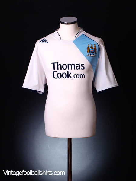
Malcolm also, IIRC, was behind the white and blue kits with the diagonal stripe that inspired the kit that Ban-jani describes as "the best change strip we’ve had in the modern era", which is a mash-up essentially of Malcolm's away kits. As an aside, I had both of the original diagonal kits and always remember that one was cotton and one synthetic - the latter was more practicable but the former looked better, but even the materials kits are made of change.

Shirt sales are important, otherwise Puma would not be paying City so much money, and that means kits have to be freshened up. I'd have us turning out in the kits I grew up on (think 1969 home and away plus 3rd strip of white with blue and red diagonal) every year but I'm not the target market for shirt sales. I do have two replica shirts from our last spell with Umbro, the ones that most look like the one's I grew up on. I hadn't worn one for a few years though until the FA Cup Final, it just felt right for a treble winning occasion.

I do find the topic of kit design interesting but ultimately all I really care about is what the guys getting paid to wear it achieve in it. If we win the UCL next year (it's about time we did), purple might become a new tradition!
 
This time next year they will be out of date - yet the last one won't be on sale until Sept or Oct. Preferred the Le Coq ones at £30, or £24 with double discount on launch.
 
Bar the shite eagle badge and the play off final kit the other kappa kits were fine mainly, loved them because they were decent.

I hated the reebok kits and we were shite then people moan when a kit is wank because it's wank and recently they have been as wank as the reebok/lecoq era
Le Coq were the worst.

I hated laser blue for a kick off, yes, even on the Kappa kit (could you imagine how nice that Kappa kit would have been in sky blue?!) but the Le Coq laser blue kits were absolutely horrendous!
 
When we wore the red and black striped away kit in 1969 a large selection of the City following hated it because we had broke tradition by not wearing maroon while instead wearing colours which had nothing to do with the club.

In the same era we broke tradition by wearing maroon on the home kit for the first time.

We’ve also broken original traditions by changing the socks from navy to blue or white.

Then we have some fans who don’t like a bit of purple championing a Kappa home shirt which isn’t even City blue.

Truth is new traditions are created all the time throughout history. There’s not a freeze on life and things will always evolve.

If we win the CL then in 10-20 years there will be a generation of fans asking for a bit of purple on the anniversary home shirt. Hell, we’ve even had an away kit based on a Play Off shirt that a lot of people love now but thought was too untraditional at the time.

I think that’s where I stand. I don’t mind a bit of evolution where a bit of trim is coloured differently in a one off year because we’ve also got a very traditional anniversary home shirt on sale. The time I’d be a bit more concerned is if we had purple sleeves, mixed with blue shorts etc.
I hate our red and black kits. Red is my least favourite colour on the spectrum. I wish we never had any red on any of our kits in our history and wish we never have them again!

But some people love them.

We also broke tradition in 1951 by having sky blue socks after over half a century with navy socks. Nobody would blink twice if we had sky blue socks now, but at one time people would have been unhappy that we moved away from traditional navy socks. I certainly want to see us wear them more often as they are what sets us apart from other sky blue clubs and is a proper traditional City sock colour.

We now have purple on the home kit. Purple goes better with sky blue than maroon does. I’ve never though maroon and sky blue go together well at all. West Ham, Villa, Burnley, Northampton and S****horpe’s kits and our maroon turnover socks are all a bit naff. However, maroon is my favourite City away kit colour and I think our 2012-13 Umbro maroon away kit was a thing of beauty - because it was maroon and gold, and didn’t have any sky blue on it!

Some people will hate the purple, like I hate our red and black kits or laser blue kits, but some will love it. I’m already liking the idea of it and think it looks proper smart to be honest.
 
Last edited by a moderator:
Ermm....

2007-08-manchester-city-third-14138-1.jpg
Fair play mate i’d forgot about that “decent” one ;)
 

Don't have an account? Register now and see fewer ads!

SIGN UP
Back
Top
  AdBlock Detected
Bluemoon relies on advertising to pay our hosting fees. Please support the site by disabling your ad blocking software to help keep the forum sustainable. Thanks.