So do we now all have to start labelling our posts in every thread with #teamcircle and #teameagle?
I'd be willing to bet that anyone who is #teameagle is only #teameagle because they have a tattoo of the current badge.
So do we now all have to start labelling our posts in every thread with #teamcircle and #teameagle?
This all day long
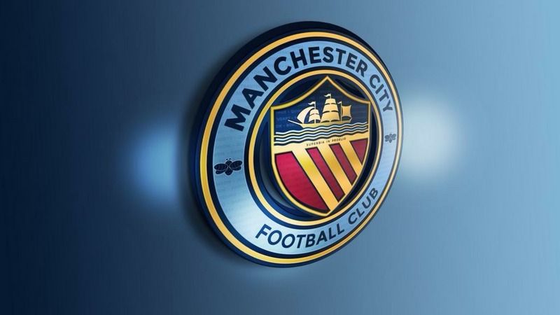
This one for me but maybe with Manchester bees instead of St Mark's crosses. Or maybe not.Just seen this on a Mexican City fans Twitter
Where the hell is that I wonder?!
I like it!
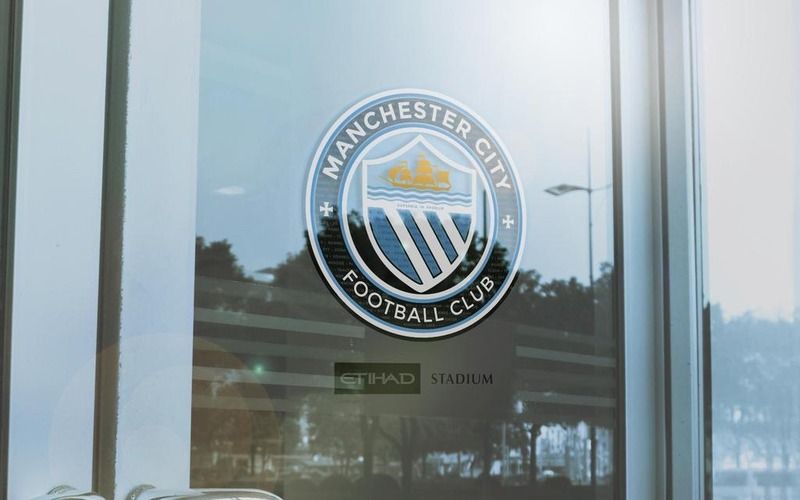
That is from GeekinGav's twitter. It's a mockup so not actually on a door at the stadium.Just seen this on a Mexican City fans Twitter
Where the hell is that I wonder?!
I like it!
Just seen this on a Mexican City fans Twitter
Where the hell is that I wonder?!
I like it!
I think it's got the Latin in the middle too..judging by the reflection in the glass it doesn't look like the uk
Maybe they have the design already and this is it like some have suggested

That is from GeekinGav's twitter. It's a mockup so not actually on a door at the stadium.
That one that looks like it's on a glass door is one of Gav's mate, it's not actually on a door anywhere.
Well done sir called the badge change correct on July 28th impressiveIm hoping no one has beaten me to the punch but hands up who really liked the old round badge and wishes it would come back to replace the Kappa designed one?
I agree, these are pretty close to perfect.
For me it has to be a roundel with that Manchester CoA in the middle.
I loved our badge in the 80s and early 90s, but the red Lancashire rose has got nothing to do with City or Manchester anymore. If we brought it back now it wouldn't make any sense.
I'm not dead set on those colours, be good to see a few different options on a sky blue shirt, but the main design is close to perfect.
I like the Manchester bees as well, but think the design of these could be tweaked to look more like the ones you see around town.
Personally, the latin writing and writing in the background could go for me as well.
I know most City fans won't really care, but I think this design also sits perfectly alongside the NYCFC and Melbourne badges.
So this design has elements of our past, present and future.