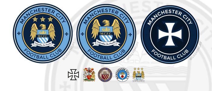
Club Badge (merged)

If we have to go back to the dated, old fashioned round style, what about having the circle with Manchester City F.C. round the border and the modern progressive looking eagle in the centre?

Can any talented chap mock this up?
I think @GeekinGav has actually done some round eagle ones at some point


nooooo i havent .... i done nothing ... i have no idea what anyone is talking about ..... shhhhhhhhh!!!!!!!!!!!!
 
a rounded badge would look better on the shirts, as Nike are persistent with having a shield over the badge, which looks crap.

I've always liked rounded badges, example being Inter Milan's
and the NYCFC badge which is nice.

And not to worry about key historical features on a new badge guys...

Qouting Stuart Brennans Article in the MEN:

Club historian Gary James will give a series of lectures on the matter and will be a part of the process. He said: “Over the years, one of the few constants at Manchester City has been discussion about the badge.
“This club knows how important its heritage is to its fans and I have been impressed with the commitment to keeping them at the centre of this project.”
 
MCFC represents the City of MANCHESTER, not the county of Lancashire (which Manchester isn't even in any more). So unless I've missed something and we're moving to Preston or merging with Blackburn Rovers, I can't see any good reason to include the red rose in a new badge, other than nostalgia.
 
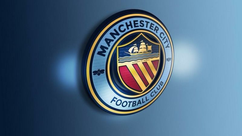
Something like this but with the eagle in the middle?
CLLRQd1W8AQGE-C.jpg


happy?? now everyone pleaaaaassseeeee!!!!! leave me alone !!!!!!!!! lol
 
I have waited for this moment for a long time and really hope sense prevails and we ditch the stupid, gimmicky badge we currently have which was at the behest (if memory serves me correct) of a fly-by night kit manufacturer.

The changing of the badge to the two historical badges, which are synonomous with our history is surely the only possible decision.

Using stupid eagles and stars is frankly small time, a rip off from another club and is more suited to the Hulls, Cardiff Citys of this world.

Badge number two for me. It is crisp, the writing looks great on the white background and is a badge probably the majority of our supporters base identify with.

Number 1 and 2 are OUR badges. The third shows how far we plummeted by adopting something associated with other clubs. It was a betrayal of our identity.
 
Pray to God Nike and Kitbag have nothing to do with this. This were behind Everton's abomination of a badge to seasons ago (the cartoon looking one). I imagine nike will want the badge to be as 'simple' as possible to save costs (like they do by printing out badge on to their standard shield design) http://static.guim.co.uk/sys-images...5/27/1369673443627/Evertons-new-crest-008.jpg

I'm pretty sure Nike had nothing to do with that mate. Kitbag designed Everton's kit and they licensed the use of the swoosh and Nike branding.
 
@Shaelumstash Gav is on to something but he's over thinking it. Those small details he's including will never fly. whoever did the NYCFC crest should be given the job. I loved it. I cant see us going with the rose again. no red in the badge for me. And the 3 rivers diagonally doesnt sit well on the eye. Its gonna be tough to incorporate the elements required but i trust the club to get something great this time.

I love the main elements of Gav's design, but I agree with you, the tiny latin writing and text in the background is just not needed and looks fussy. The core design though is exactly what I'd want to see - roundel, full club name, Manchester Coat of arms in the middle. It's simple, as most iconic brands are.

I'd be really interested to see your interpretation if you are a professional designer?

The guy who did the NYCFC one is called Rafael Esquer. People have approached him on Twitter and he said he's not been approached by the club yet, but he knows all about Manchester City, he loves us and he'd fly to Manchester tomorrow to be involved. He also commented on Gav's main design and said he thinks the three stripes and the Maltese cross should be included. I hope they do get him involved because I think NYCFC's badge is absolutely superb and if he could design something similarly as iconic for us I'm sure we'd all be delighted.
 

Sounds promising.


image.jpg


Rafael Esquer (NYCFC badge designer) has said he's not been approached by the club yet, but he knows all about Manchester City, he loves us and he'd fly to Manchester tomorrow to be involved.

He also commented on Gav's design above and said he thinks the three stripes and the Maltese cross should be included, but suggests he could improve the design even further. I hope they do get him involved because I think NYCFC's badge is absolutely superb and if he could design something similarly as iconic for us I'm sure we'd all be delighted.
 
Pray to God Nike and Kitbag have nothing to do with this. This were behind Everton's abomination of a badge to seasons ago (the cartoon looking one). I imagine nike will want the badge to be as 'simple' as possible to save costs (like they do by printing out badge on to their standard shield design) http://static.guim.co.uk/sys-images...5/27/1369673443627/Evertons-new-crest-008.jpg

Everton fans started a petition against one of their shirt/badge designs. 20,000 signed it and the club listened & backed down. Fair play to Everton fans.
 

Don't have an account? Register now and see fewer ads!

SIGN UP
Back
Top