Club Badge (merged)

Voting/views etc. to be done as Cityzens or via City Voice.

Am I the only one worried about the number of non-local fans (i.e. international fans who tend to be more involved with the club via the internet and who may know little about our city and history) having too big an influence over it given a large number of local fans (if not most) aren't that arsed about Cityzens stuff usually?

Depends on the options we're given but they may be more likely to favour the current one for example if that's all they know, or other options that may reflect the city poorly. Obviously I feel the views of local fans/fans with connections to Manchester/long-time fans/fans who know the history of the club's identity are more valuable than someone abroad who has a mere interest in City and is a registered 'Cityzen' as the badge should represent the city and be in keeping with history.

I assume by Cityzens they mean all rather than just members with access to buy tickets (such as the old blue card members or season ticket holders) - not sure of the ins and outs of the current system.

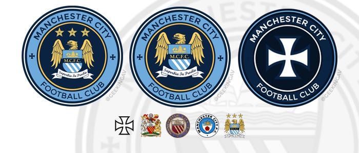
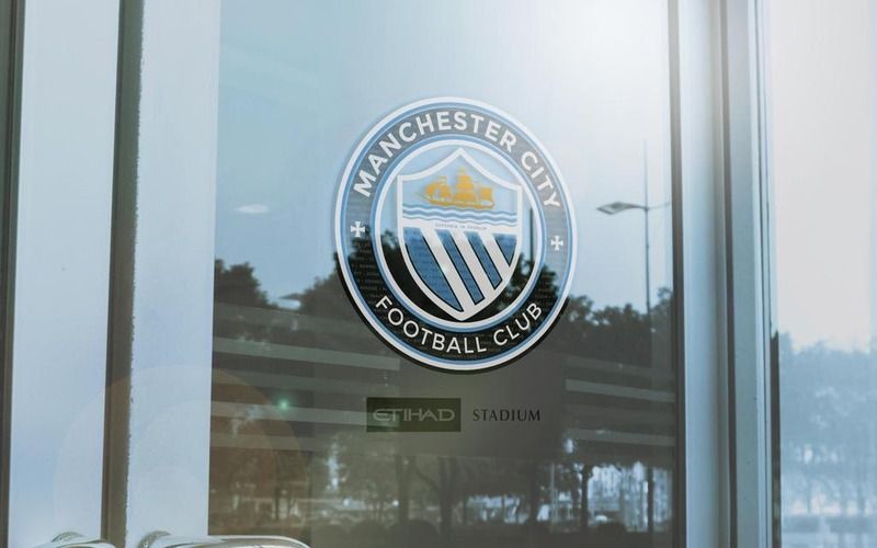
I assume we'll change to a circular badge but I just hope it's the best it can be. Personally I'm not keen on having any red whatsoever (other than lancashire rose, which probably isn't appropriate anymore) as that badge was before my time and we've evolved.

I share your concern.

I for example have never met a Manc who prefers the current one over the old one but I'm afraid we'll see thousands of Thais etc voting for the current eagle as that's the only one they know...

Personally I'd restrict the voting right to season ticket holders only but that's not gonna happen is it. So hopefully they'll give more weight to those answers from City fans with MCR postcode

I'm still quite sure we'll get a nice design eventually. Everyone can't be pleased anyway
 
I'm Torn on this. I grew up with the middle one, and I'm proud of the fact City fans have never forgotten where we came from. But then all our (recent) success has come with the Eagle and is recognised globally now as the brand of City.

I think to fall in line with the CFG we will end up going circular again, but I wouldn't mind a nod to our recent (eagle) badge in there somewhere.
 
Our badge should be based around this...

100px-Coat_of_arms_of_Manchester_City_Council.png
 
I think it's pretty obvious that we are going to get the same basic badge as the rest of the city group. What hasn't been decided is what elements will make it eg ship, rose, rivers, bee, cross, shit bird, pointless stars
Bonus is cheapos nike won't have to put a shield round it when they do the kits.
 
Last edited:
A theory that we're returning to a circular crest to fall in line with New York, Melbourne and others is concerning. They only exist because of us and their badges should be like ours is. Personally happy enough with the current one.
 
Agree. Ditch the rose and go with rivers, bees and st marks, or 2 of the 3 if putting all in is too much


Good shout on bees, I think they are a classy symbol of manchester's rich history and would like to see them incorporated.

From a purely selfish point of view, I hope superbia in proelio stays, because I have it tattooed on me.
 
I've got the current badge tattooed too. Perhaps the classic may have been better in hindsight but, in all honesty, I only began going when we used the new one so it's what I know.
 
I share your concern.

I for example have never met a Manc who prefers the current one over the old one but I'm afraid we'll see thousands of Thais etc voting for the current eagle as that's the only one they know...

Personally I'd restrict the voting right to season ticket holders only but that's not gonna happen is it. So hopefully they'll give more weight to those answers from City fans with MCR postcode

I'm still quite sure we'll get a nice design eventually. Everyone can't be pleased anyway


Er No! I beg to differ please. I haven't got a Manchester postcode, I'm Sk9, but go to all the home games and as many aways as I can get tickets for. Been a City fan all my life and as teens it took us longer and was more expensive to get to the Kippax on public transport than local fans, and obviously still does. Why does that make people outside MCR have less of an opinion please.
 
I'd missed the post code thing. Can E6 not have a go either? Perhaps my seasoncard is irrelevant...
 
A theory that we're returning to a circular crest to fall in line with New York, Melbourne and others is concerning. They only exist because of us and their badges should be like ours is. Personally happy enough with the current one.

Well considering our original badge was round your argument falls at the first hurdle really..we are not doing it to fall in line with them
 
Er No! I beg to differ please. I haven't got a Manchester postcode, I'm Sk9, but go to all the home games and as many aways as I can get tickets for. Been a City fan all my life and as teens it took us longer and was more expensive to get to the Kippax on public transport than local fans, and obviously still does. Why does that make people outside MCR have less of an opinion please.

Totally agree with you. Same boat as you. When we were at Maine Road I lived in a WA14 postcode, now I live in a CW7 postcode.
 
I was pretty happy when I found out we could be having a badge change but reading other peoples views on what the new badge should have on it is making me worry that we are going to shoot ourselves in the foot.

For me it would be the one we had from 72-97.
 
The badge needs to be extremely similar to these designs. (And it will be).

image.jpg


And here is a brilliant design from @only1gav

image.jpg
I really doubt the new badge will just be a recolour of our very first.

In global marketing terms I wonder if we want a more relatable element on the badge.

I imagine we'll get a modern, stylised take on retro like Chelsea, Arsenal, Juve that works in 1 colour, flat no gradients and no shadows - in a CFG roundel.

In design terms I feel the gap between the roundel and the shield is a consistent issue, while the fully filled circle tends to look cheesy.

The best badge of all is the NYCFC badge.
 
I've thought about giving a go but never had the time to really think about it

I did this for our supporters group. Obviously vibing off the NYCFC design. I was so pumped when it came out i did my own version of it.

fcKlIMM.jpg


Can't wait to see what they come up with after this 4 week consult is over
I like what you've done there. Clever use of the hills of both Hollywood and Blackburn.
 
5e7a51ebc7788b5c2716208d8e3e5a3a.jpg
f3fd4845afbdac3c5cbbee32470c85c4.jpg

If the new badge was anything close to either of these two then I'd be very happy.(Great work Gaz [emoji106]).

Now for my input on 'history' though:
We have flipped between the rose and the lines over the years and if you read back, the origin and meaning of the lines is disputable. I'd like city to include something with historical reference which also gives a new twist to the badge. I'd replace the lines with the worker bee. It has historical significance to Manchester, is part of the crest and is even in a mosaic in the town hall floor.

Here's an extract re: manchester's worker bee:

"The worker bee was adopted as a motif for Manchester during the Industrial Revolution, at a time when Manchester was taking a leading role in new forms of mass production. Seven bees are included in the crest of the city's arms which were granted to the Borough of Manchester in 1842. The bee denotes Mancunians' hard work during this era and Manchester being a hive of activity in the 19th century."

3c181cc452b1a4cc8946d1321377413c.jpg

638fe860c09f499ecd6d4500f00fdf99.jpg

8f6a87afb5735574a8809db94be2776d.jpg
 
Last edited:
I would have an empty seat / a wad of cash / a picture of the shiek and 2 fingers! and 5 stars above the badge not 3.

Fuck em!
 
The eagle badge has to go. It's really crap and looks like it belongs on the flag of Azerbaijan. I reckon the club have already decided on a new badge and this 'consultation' is a way of covering all bases. For continuity purposes, It'll probably be similar to the Melbourne and NYC one, as in a blue ring, with a simplistic motif inside.

I shouldn't be amused, but there's gonna be a lot of blokes walking around with that awful eagle tattoo'd on their skin, and some meaningless latin phrase inscribed along the length of their forearms. They should have listened to their mothers!
 

Don't have an account? Register now and see fewer ads!

SIGN UP
Back
Top