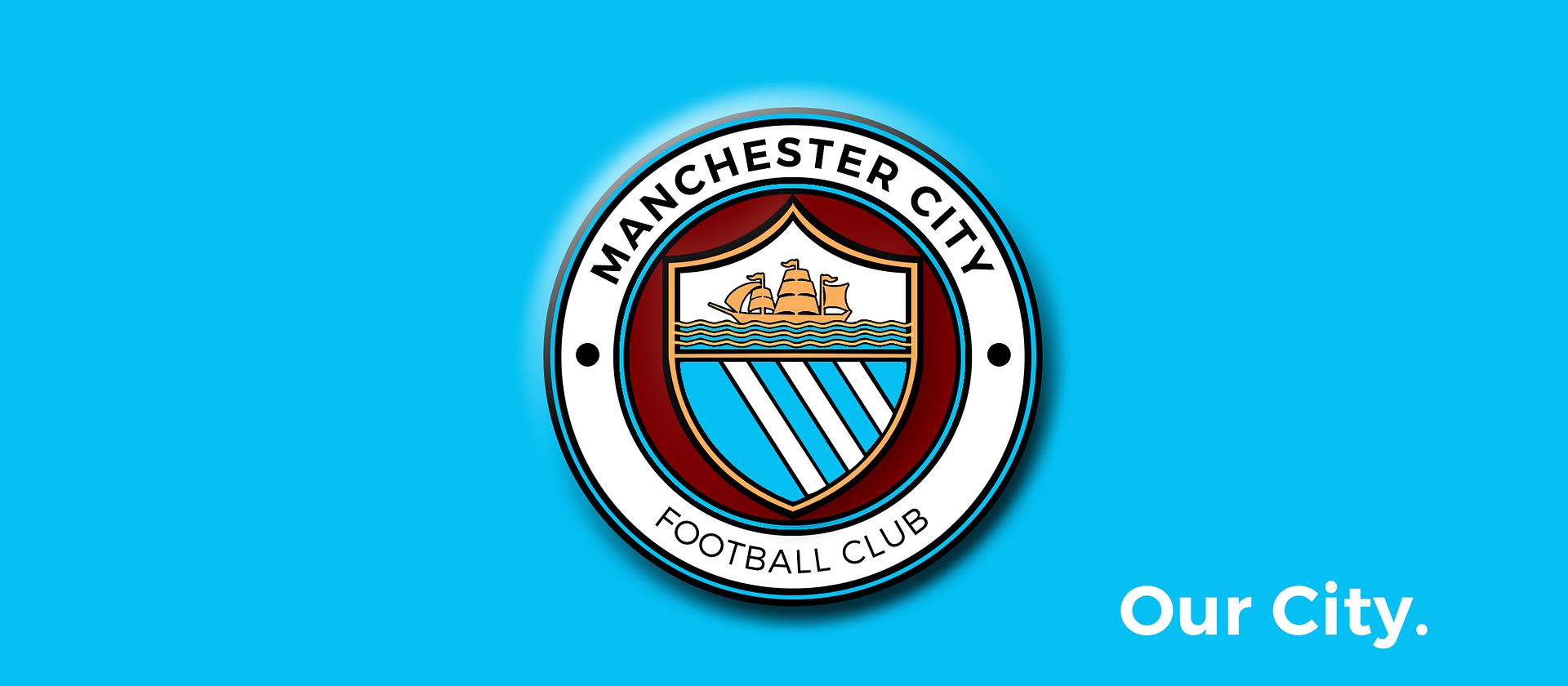
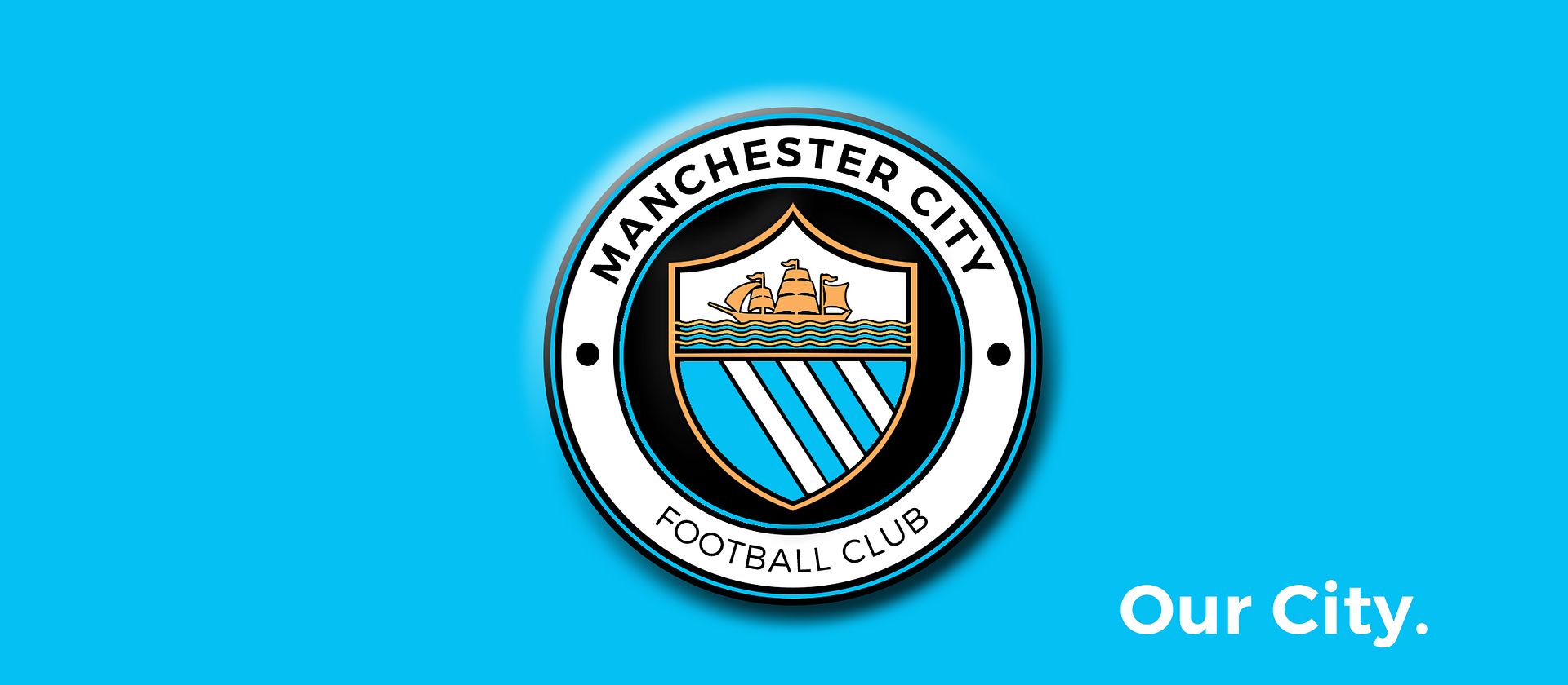
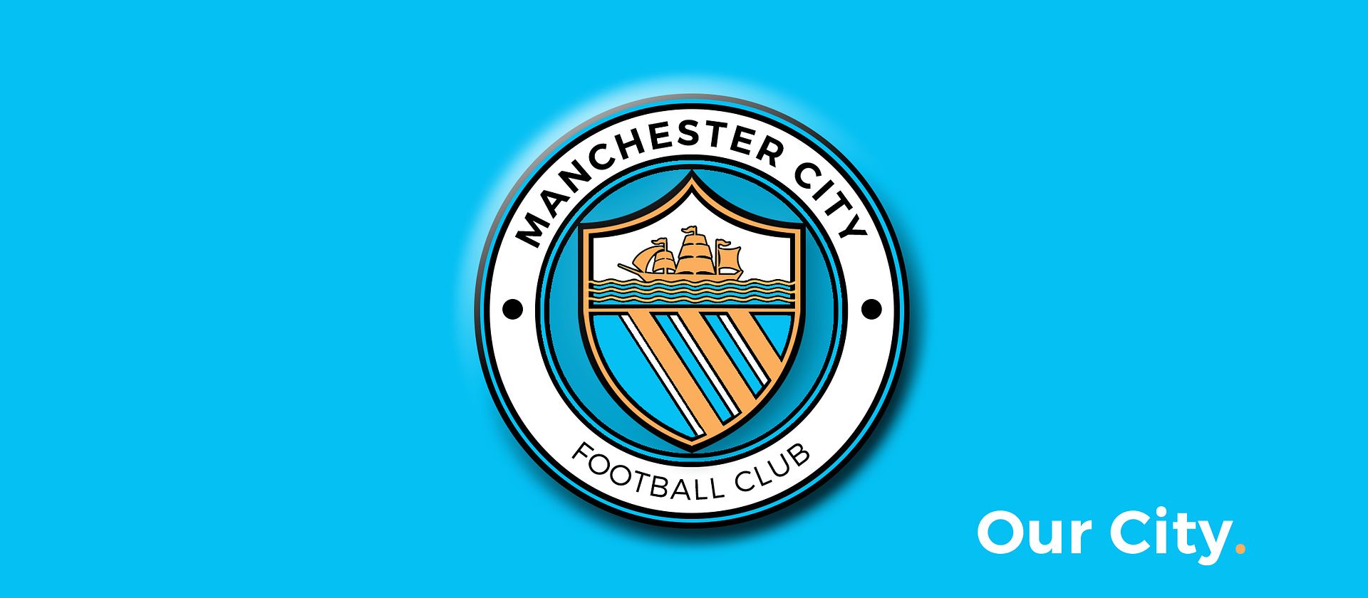
Club Badge (merged)

I know it's not overly popular but Maroon looks good as a fill between the Script Ring and the Shield. And I accidentally tried black after not switching my colours and it actually looks alright, think some might like it.


EDIT: Give grey a go as well Gav, see what you think, With metalic silver thread it could look interesting? It certainly doesn't detract when I try it.

people hate my metal versions. tbh the reason why i have no colour behind my centrepiece is purely to rebel against the CFG badges that have a filled centerpiece ... plus it opens it up for different colours when its put onto different things like kits, that was my personal thing.
 
Ditch the 3 stars and bird, go back to a round badge design. The only reason we have the current badge is because the club was a shambles and didn't own the rights to the old one. Maybe incorporate the Latin motto as a nod to the current badge, but that's it. Lets have a new badge for this new era at Manchester City.
 
Don't know if you are able to but I'd be very interested to see that mock up you are referring to, but with "Manchester City F.C." going around the outside, just like on our previous badges.

And then just a single symbol at the bottom, either a bee or St Marks cross (as the 2 bullet points/pinholes on the sides don't mean anything). That would be much appreciated mate!

Done my best for you mate. I'm not a graphic designer so apologies that they look amateurish.

9ShkfSi.png


QP1dWVz.png
 
The 3 rivers running through Manchester City centre, the Irk, Medlock and Irwell. Features on the Manchester City Council coat of arms, the old City badge, the old United badge and the Current FC United badge.

For me, the rose, although it looks good, is completely irrelevant to modern Manchester. Also, City draw a fair portion of support from area of Greater Manchester which have never been part of Lancs, such as Hyde and Stockport.

that shouldnt have anything to do with it imo, its manchester and that should be relevant, nothing to do with stockport or salford or places like that
 
I completely agree with this mate. The white circle looks infinitely better on the shirts.

Number 1 is more in keeping with the Manchester Coat of Arms, and I think would look better on the shirts as the gold and red would pop out.
1.
UYn4sif.png


But number 2 looks more "City". Without reading the text, you'd instantly recognise it as a City badge. Imagine it on a poster or in the background on MNF, you'd instantly know it was City. It also has the same basic design as our first badge, the white circle of the 72-97 badge, and has the blue and white shield of the current badge. So it has elements of all 3 of our badges, and the Manchester CoA. I think I might be swaying towards number 2.
2.
zuA7Fqv.png

It's got to be the second one all day, like you said it immediately looks "City" - I'd like a black ship to represent St.Marks, but then again the gold keeps it in the same colour scheme as the current badge so I'm undecided on that.

If we have a St.Marks cross anywhere it's got to be white and probably on a black background otherwise it's not the St.Marks cross.

I don't know where the argument for maroon is coming from? Just as an alternative to red is a poor argument as it doesn't reflect the CoA (so you might as well have blue) and away kit colours or a stripe on the socks for a few years shouldn't influence the badge design I don't think. I just don't think Navy/Royal blue should be in there either on the badge as it either makes it feel less "City" (even though we've had it on kits for many years) or it's just one colour too many.

Just looking at the history of our home kits (http://www.historicalkits.co.uk/Manchester_City/Manchester_City.htm) and wondering why the f Le Coq Sportif couldn't ever get a sky blue kit done.
 
I know it's not overly popular but Maroon looks good as a fill between the Script Ring and the Shield. And I accidentally tried black after not switching my colours and it actually looks alright, think some might like it.


EDIT: Give grey a go as well Gav, see what you think, With metalic silver thread it could look interesting? It certainly doesn't detract when I try it.

Apologies for the plagiary and for the poor attempt in general. Just wanted to get the concept out there for the birdie!

21bera.jpg

2my0zy9.jpg
 
Last edited:

Don't have an account? Register now and see fewer ads!

SIGN UP
Back
Top
  AdBlock Detected
Bluemoon relies on advertising to pay our hosting fees. Please support the site by disabling your ad blocking software to help keep the forum sustainable. Thanks.