Club Badge (merged)

What about this??
City%20Badge%202_zps838rjyn2.png

i like the idea of it, just agree with the poster above far to busy and stripes dont fit in in my opinion. Keep the rose and the bees though. the cross would have to be tiny or placed somewhere else
 
If you're wanting the stripes, bees, cross, colours, ship, shield and a round badge then I still think mines got them all, without it being too crowded... But I'm gonna say that aren't I? [emoji6]


And it's a nod to the current and previous badges

32fcdf7fe08b2bd2db85b739544d1fea.jpg
 
I must admit I thought it was a pheonix... thinking about it I don't know why I did, maybe I connected "rising pheonix = blue moon rising". Why eagles then? Maybe swap it for a peregrine falcon?

Anyway although I'd rather keep the current badge than all the faffing around and tattoo removals a new one will cause, I don't mind this one.

CRZALyeUYAAn8j6.jpg

I prefer the crosses instead of bees taken from yesteryear kit..
16035.jpg


surprise.gif
 
Last edited:
If you're wanting the stripes, bees, cross, colours, ship, shield and a round badge then I still think mines got them all, without it being too crowded... But I'm gonna say that aren't I? [emoji6]


And it's a nod to the current and previous badges

32fcdf7fe08b2bd2db85b739544d1fea.jpg
Quite nice actually.
 
I must admit I thought it was a pheonix... thinking about it I don't know why I did, maybe I connected "rising pheonix = blue moon rising". Why eagles then? Maybe swap it for a peregrine falcon?

Anyway although I'd rather keep the current badge than all the faffing around and tattoo removals a new one will cause, I don't mind this one.

CRZALyeUYAAn8j6.jpg
Potentially the only change worth considering with this would be a maroon background for the rivers?
 
If you're wanting the stripes, bees, cross, colours, ship, shield and a round badge then I still think mines got them all, without it being too crowded... But I'm gonna say that aren't I? [emoji6]


you'll probably end up with something close to the Melbourne City FC badge.with all the elements on 1 badge ... ie. too overcrowded.

there should be a max of any three symbols. 1 on the outer band, 2 max. in the centerpiece.
 
We still are lancashire.

Just because some nobhead politicians down south suddenly decide to carve out 'Greater Manchester' - whatever the hell that means since it includes towns completely different and distinct from the Manchester area and culture doesn't mean we suddenly stop being what we've been for hundreds of years.
At the same time, a whole generation have grown up not being in Lancashire, and writing Greater Manchester on their address and feel part of that! Just to say there's always another side of the coin.
 
I don't think it's too crowded. It's similar to the previous badge, and keeps the sky blue and the white still. The stripes have the maroon band running through like the retro scarfs and maroon turnovers from years gone by
 
Whatever the design I still think this colour scheme only (red only if it's a rose included):


I'm really not liking the reds, navy blue, maroon and too much black I'm seeing. This above, like the old City badge looks the most City to me. Our identity has evolved since the red/maroon and gold of the CoA and our first badge (which is a very long time ago now). The one on the door everyone likes, is a nice throwback to St.Marks but there's barely any sky blue in it.
 
Last edited:
We should keep a bird of prey but make it more like the UAE hawk. Ditch the embarasing stars and revert to the centre of the Manchester coat of arms with a sky blue background. No Lancashire rose as that's only 45 ish years old itself.
 
Okay, now the ship really represents the St.Marks kit (the cross if included, would be better white on a black background if poss). My final alternative of what I can come up with:

35a6vzq.jpg
 
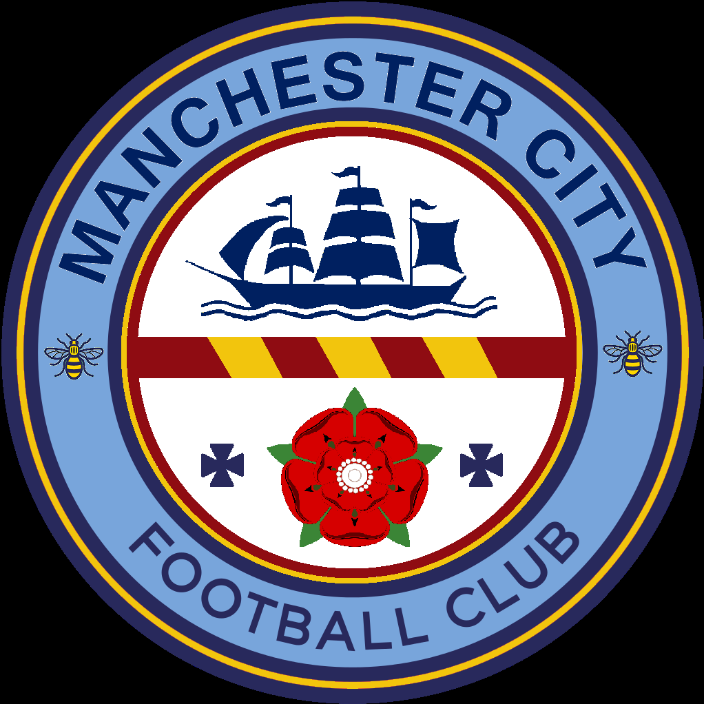
Here's how you incorporate the sky blue/white, red rose, 3 rivers, a nod to St.Marks, some of the CoA colour scheme and the Manchester bee (colour scheme):

1zn0swh.jpg


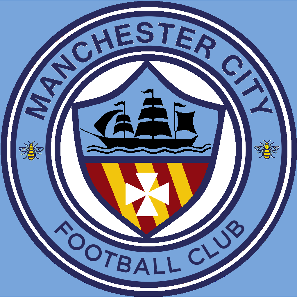
...And here's a modern, predominately sky blue/white alternative in keeping with the current badge's colour scheme of the rivers:

9kv7rr.jpg


Sorry if my image editing skills (of GeekinGav's original design) make you feel inadequate about yourself ;)

I'd be happy with a professional's tidier version of the second one, I think it incorporates everything important about the club's history and Manchester without going over the top. I think a black ship is a class thing to include to represent the original version of the club and original kit - plus it doubles as a silhouette style. Looking at the top one - I'd thought about including more black to represent St.Marks but after seeing it, that would likely encourage Nike to give us sky blue/black strips rather than sky blue/white like we should be.

i say this with a touch of jest and a touch of a firm back hand .... stop fycking up my work lol
 

Don't have an account? Register now and see fewer ads!

SIGN UP
Back
Top