frimpongs_buzzin
Well-Known Member
Re: This should be the new club badge
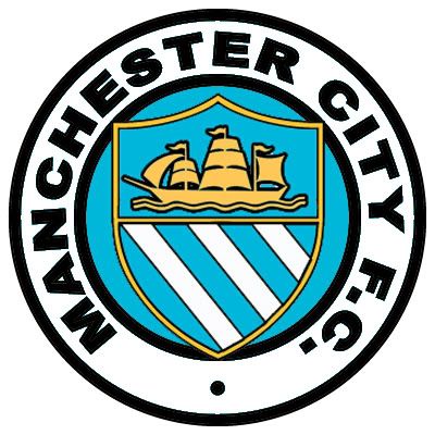
I get what your saying, but its a shield of manchester 3 shipping canals, just because those teams had it doesnt mean we shouldn't.. we have the shield on our shirts now, and we were using that badge before the scum and Fcum
jrb said:TheMagician said:A picture of the Manchester City emblem which has been appearing on new items in the club store. The design is absolutely spot on in my opinion.

Rags.
(This is a former logo of Manchester United F.C. and can be found in an unedited form at [http://www.manutdzone.com/funstuff/clubbadge.html]. It should qualify under Wikipedia's Fair Use policy as it is only intended to represent the club.)

FCUM.
.jpg)
I get what your saying, but its a shield of manchester 3 shipping canals, just because those teams had it doesnt mean we shouldn't.. we have the shield on our shirts now, and we were using that badge before the scum and Fcum